From a young age I have always been influenced by Japanese art & culture. My dad would travel frequently to Japan for work, bringing home snacks, toys, stationery, and the influence of Japanese culture with him.
There is no debate that Japanese design, packaging, art, traditions and food have swept over the entire world and left us in awe of how beautifully and meticulously they work. But what makes Japan such a strong force in the world of art and design, and why does it stand out from other design practices?
Japan’s graphic design had three phases of growth and change. Up until 1868, Japan had closed its borders, preventing any influence from the outside world. What this allowed for was for traditional arts and practices to flourish and create their own identity. The opening of Japan’s borders after 1868 had a profound influence of Western design on Japan and vice versa.
The next phase was the Post War era from the 1950s to 1980s, which saw Japan’s industrial boom, making it the third largest economy in the world. Industrialisation and economic growth laid the path for the exploration of European design movements such as Constructivism and Bauhaus. The strong geometric shapes and patterns born from these movements were combined with the Japanese concept of symbolism, creating something uniquely Japanese.
Finally in the 1990s, following the economic collapse of Japan, is when graphic design in Japan truly exploded. The unique history and culture led to the creation of Japan’s graphic design as its own genre of design. Some traits and characteristics that make the core of Japanese graphic design are – Minimalism, Nature, Symbolism, Geometry, Custom Typography and Kawaii.
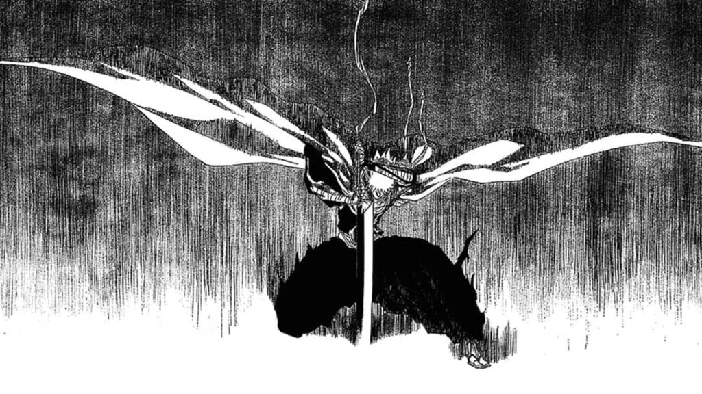
The journey of how Japanese art and design shaped me begins with Anime and Manga. One of my favourite Anime to watch while growing up was ‘Bleach’. The original Bleach series was a frame by frame hand animation, which allowed for some really epic frames. I would meticulously trace the artwork to learn character design. Today all my artwork reflects my learning from watching Anime.
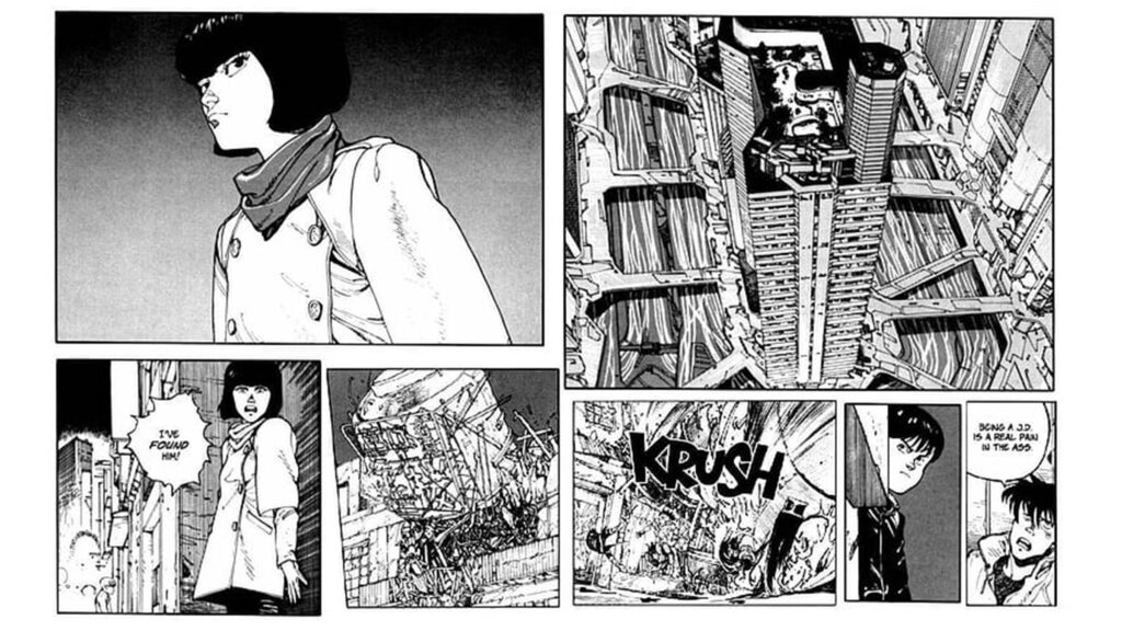
Favourite Manga series of all time, hands down – Akira.
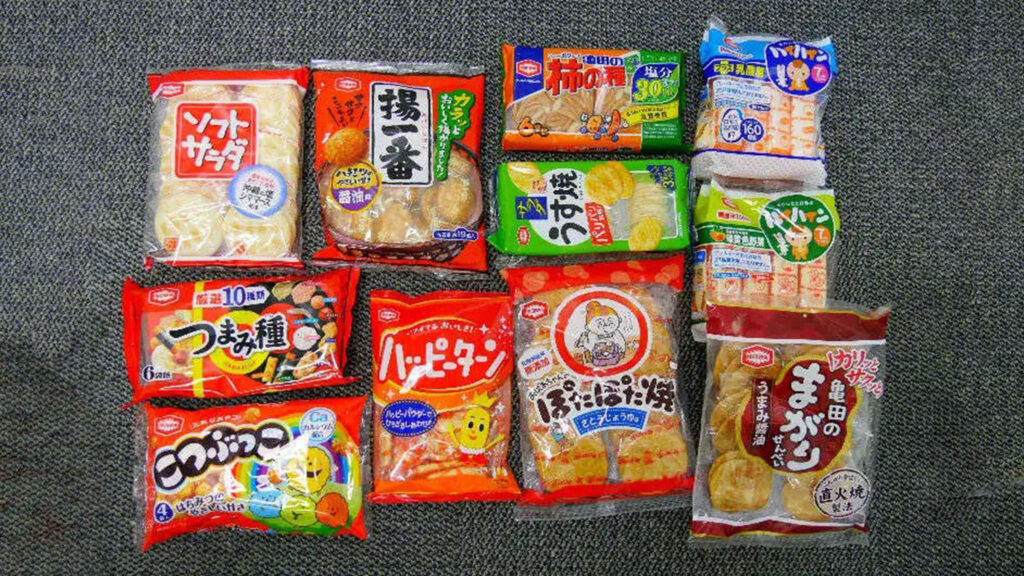
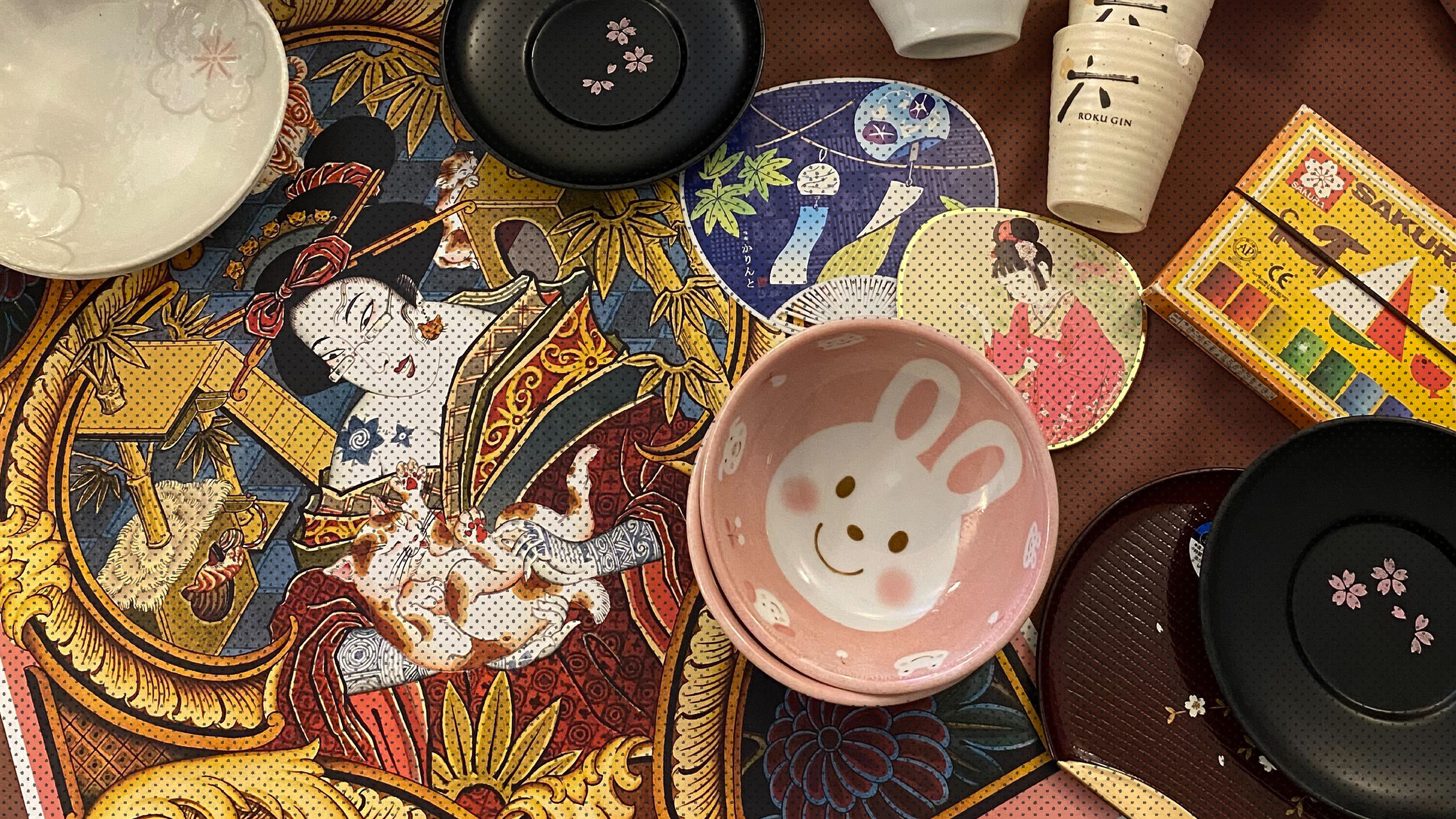
And then we come to why I really truly love Japan, their food! As a kid I would wake up at odd hours of the night to welcome my dad back home from Japan, but what I was really waiting for was the snacks. Even today, Japan’s meticulous care in designing innovative packaging, which always champions user experience, never fails to amaze me.
Why does Japan put so much emphasis on packaging? Japan’s culture plays a really important role in this factor. Japanese culture holds high regard for cleanliness and attention to detail. A well packaged product signifies quality and care, leading to preference for individually wrapped products. Another consideration is that the general population spends large parts of their day commuting. In those circumstances, having individually packaged items makes for easier consumption.
Lastly, great packaging is an integral part of branding and marketing. Eye-catching and innovative packaging is a great way to communicate your brand values and attract customers. However, Japan’s excessive use of plastic packaging has come under scrutiny over the years especially when the world is trying to battle climate change and decrease wastage. What measures Japan takes to shift to more sustainable packaging is yet to be seen.
Japan is the perfect example of how staying true to one’s culture and building on it can help create designs of global standards. Given my love for all things Japanese, one of my personal favourite branding projects would be Zoku. We selected the name Zoku as it is a Japanese term meaning ‘clan or tribe’, to represent a tribe of customers who could build a loyal community around the restaurant.
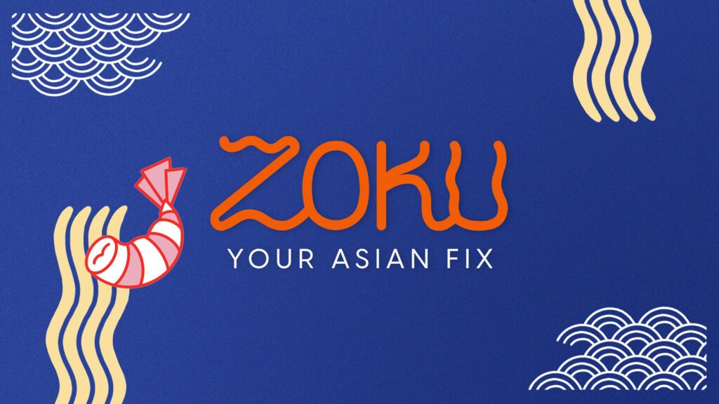
The branding for Zoku is young, modern, colourful and friendly, overall easy to associate with young South-Asian urban culture. It takes inspiration from the Kawaii design style to create fun graphics. The wordmark itself is created using wavy lines to represent noodles. The main motif showcases a hand holding up a dimsum, almost as a trophy to champion the quality of food offered at Zoku.
We often see brands that are looking to create a global presence, shy away from championing their origins and delivering designs that only reflect Western ideologies. Japan is a great example of primarily allowing one’s traditions and culture to inform one’s design, while also taking inspiration from other design styles.