Zoku is a pan-asian restaurant in Delhi NCR that offers a richer and wider Asian menu to guests. Being fun, loud and welcoming with the highest quality food is their approach to being a crowd favourite.
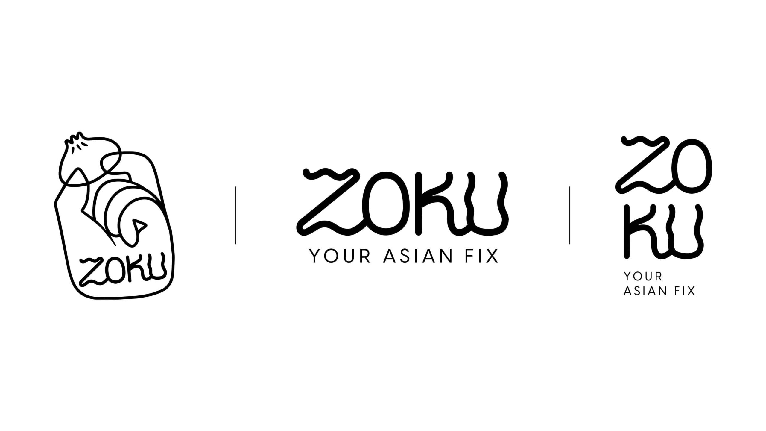
When it came to choosing a name for the restaurant, our associative canvas included family, good food, fun, memorable, authentic and just about whatever an approachable Asian dining place should be. Meaning ‘tribe’ or ‘clan’, we chose the name ‘Zoku’ to represent a tribe of food lovers who could build a loyal community around the restaurant.
Visual Identity
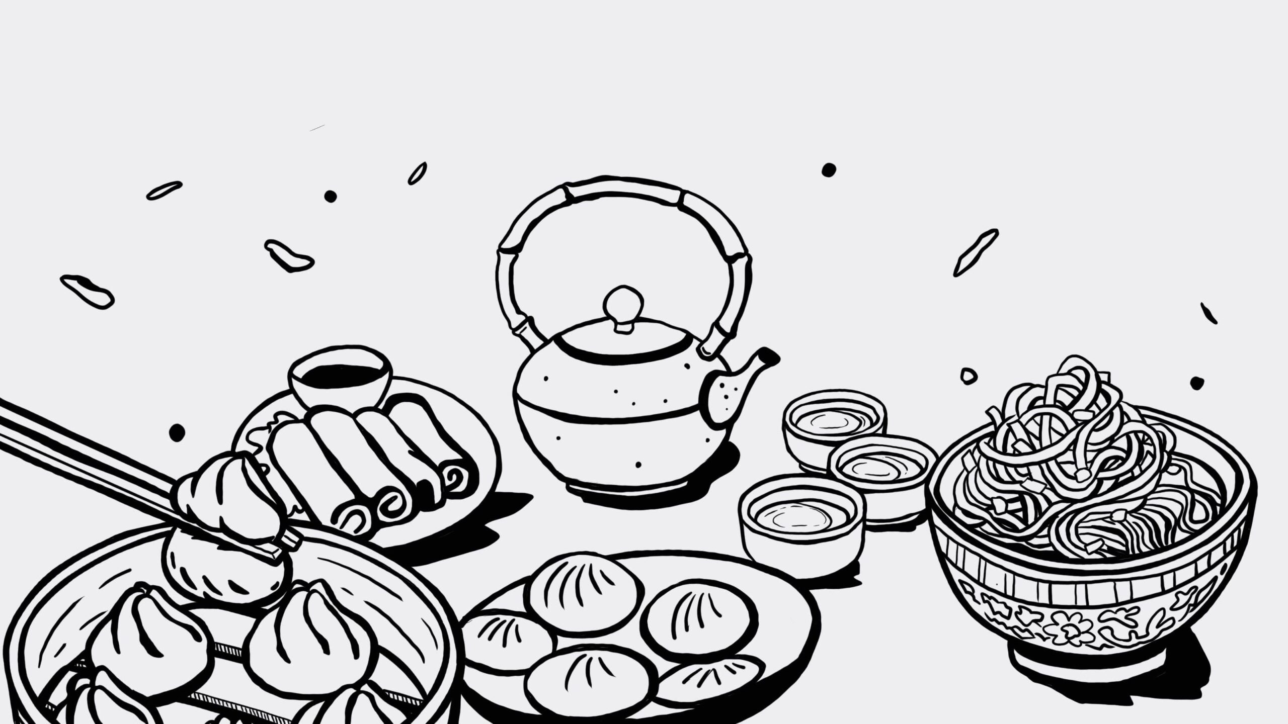
The wordmark is a handwritten logo, its fluid and curvy lines inspired by noodles. The primary motif is a hand, teasingly holding a dimsum, almost like a trophy. The branding is young, modern, colourful and friendly, overall easy to associate with young South-Asian urban culture.