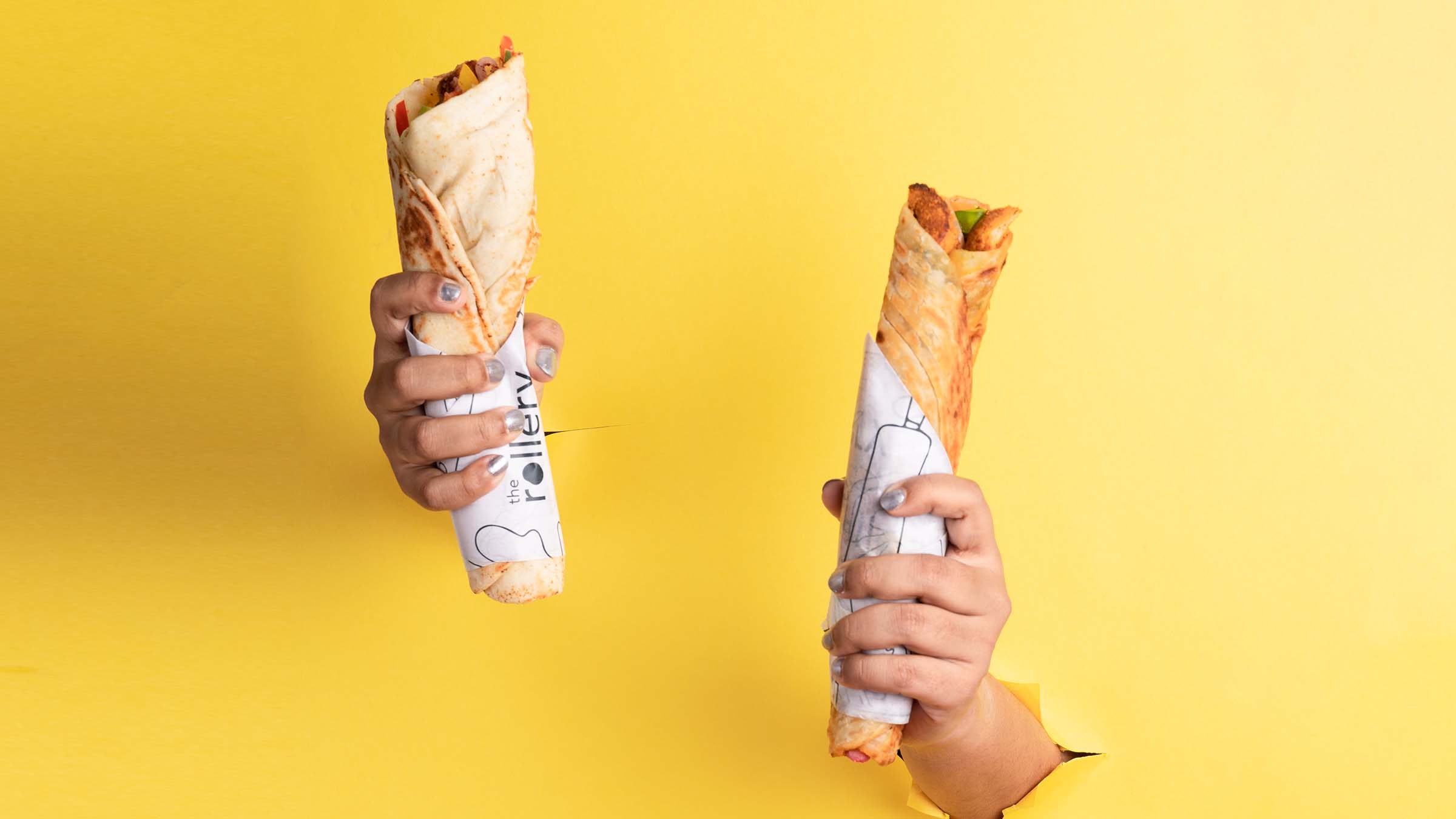
The Rollery is a cloud kitchen that focuses on selling rolls. Their aim is to elevate the humble kathi and Calcutta roll to give it a gourmet and fresh avatar. They also wished to develop a category of ‘exotic’ rolls which would allow their loyal customer base to experiment and try new dishes on the regular. Their target audience includes the young, working class that is always short on time and on a budget, but never on taste.
Visual Identity
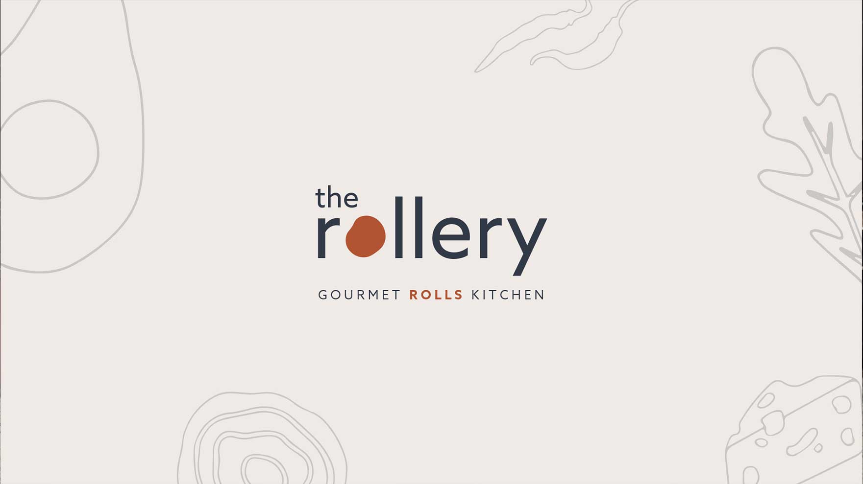
The name ‘The Rollery’ was developed to make the actual offering front and centre, given that in a market like India, it sold itself. We just played the tasteful conduit with better ingredients and the right craftsmanship. The visual identity is simple, modern, fun and minimalistic, with a touch of earthiness. The wordmark is created by replacing the letter “O” with an organic shape of a lump of dough, one of the key elements for a good roll. At its conceptual centre, the branding as much an homage to the roll as it is an upgrade of its image.