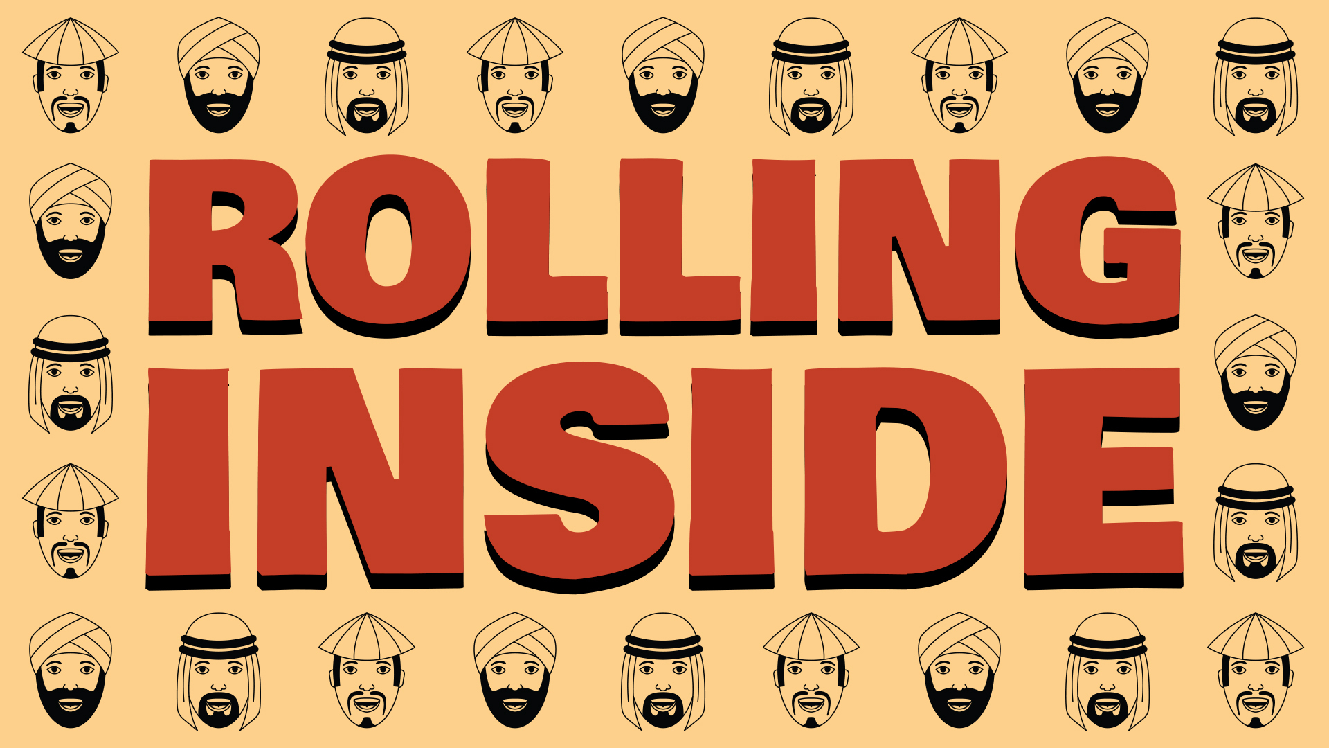
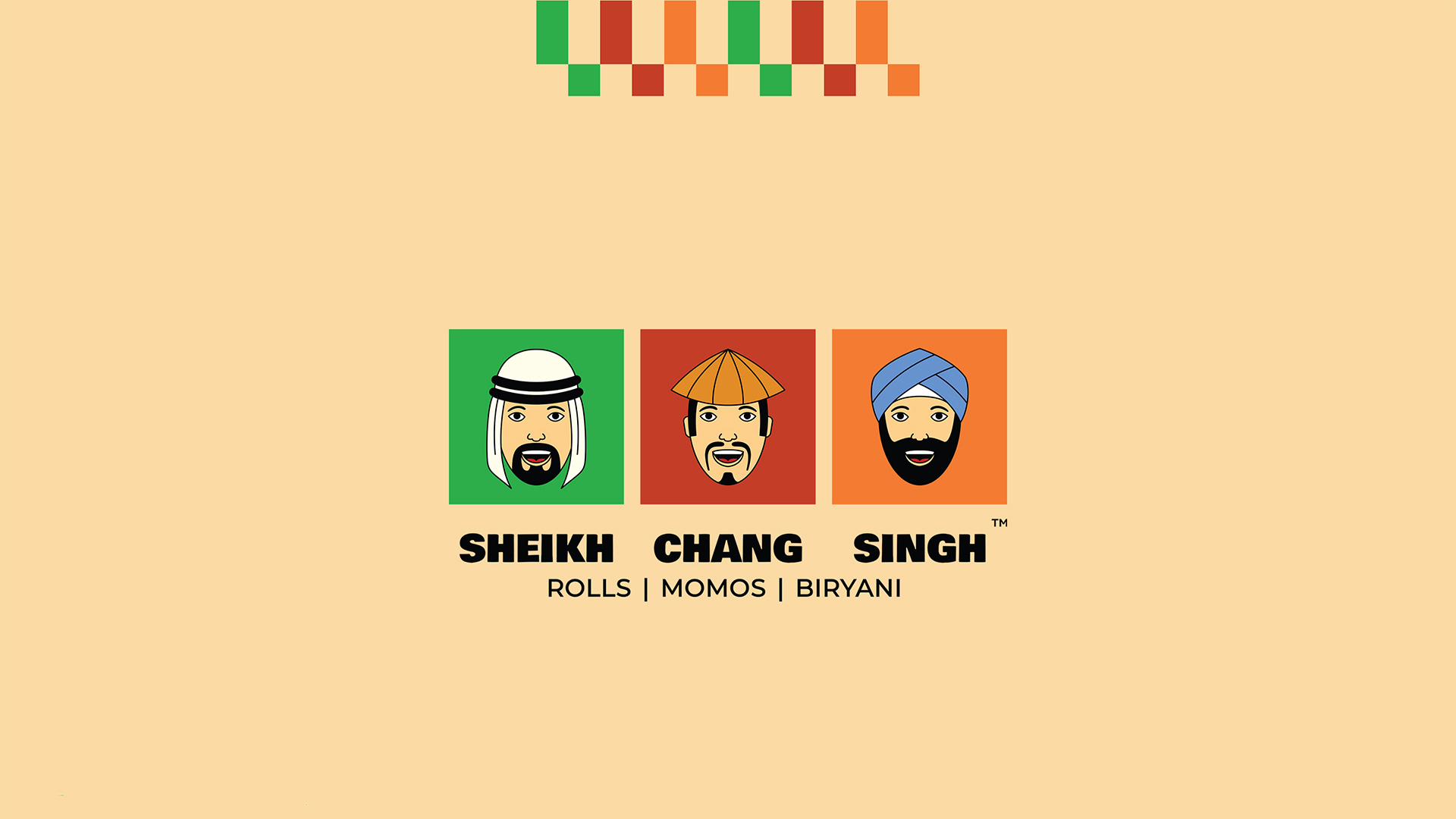
Sheikh Chang Singh is a QSR with over 7 outlets in Delhi NCR. They primarily focus of three cuisines, Middle Eastern, Chinese and Indian- specializing in Roll, Momos, Biryani and Curries. The brand approached us to help create their visual identity, before their launch in 2020.
Since the brand’s name in itself is quirky, the visual identity had to help amplify that with the overall design style. In spite of launch during the pandemic, the brand has been extremely successful.
Visual Identity
The journey began with the character illustration, the heart of the brand’s visual identity. We explored various styles, meticulously honing a design that felt both welcoming and friendly – like familiar inviting faces of the brand representing the diverse cuisines. At the same time, we infused a touch of maturity to reflect the brand’s established culinary expertise.
To ensure the visual symphony wasn’t overwhelming, we opted for a limited color palette. This created a cohesive look that wouldn’t bombard viewers. However, simplicity didn’t equate to monotony. We carefully selected colors that evoked the essence of Sheikh Chang Singh’s diverse menu: green, reminiscent of the fresh herbs and spices prominent in Middle Eastern cuisine; red, symbolizing the bold flavors often used in Chinese cooking; and orange, representing the vibrant spices and warm curries that are a staple of Indian food.
We crafted the final logo in three variations; this ensured flexibility for various applications, from signage to packaging, allowing Sheikh Chang Singh’s visual identity to seamlessly adapt and thrive across different mediums.