OMO cafe is a farm to table, pure vegetarian restaurant in Delhi NCR. It aims to serve the best quality, locally and sustainably sourced produce to its customers. It is a soul food community cafe that focuses on European style dishes. The name OMO is formed by their three guiding principles, “original ingredients sourced from farms; maternal nourishment in every morsel; omniscience about the botanical world”.
Visual Identity
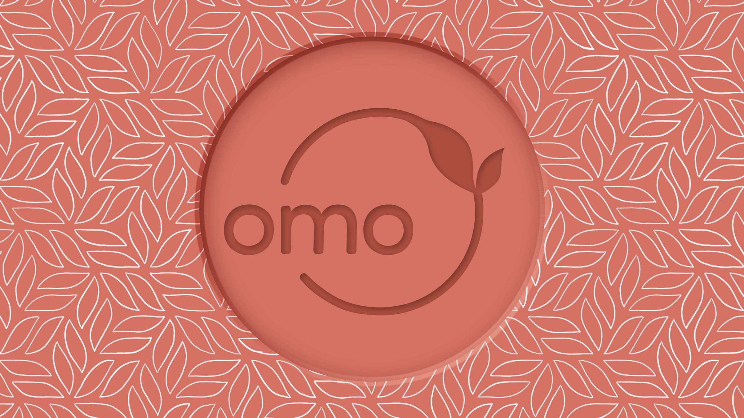
When designing the logo, we wanted to subtly but effectivity encapsulate the 3 principles in one simple element – thus giving rise to the circular design form with the brand name surrounded by a vine. The logo on the whole is soft and organic, friendly and inviting but not kitsch or hipster. The brand colours chosen are natural and organic to resonate with the natural elements used in the restaurant’s interiors. In keeping the visual language of the restaurant, the overall brand identity is raw, open and light.