Beewoke Hivery is a beverage brand specializing in mead products. Mead is a type of alcohol derived from honey and is also known as the elixir of the gods, thought to have been originated in India. Despite mead being developed in India, the market for mead is still very limited in the country.
Beewoke Hivery take a traditional spin on mead by incorporating 71 ayurvedic herbs in their brew. The brand will partner with a beekeeping university/ a group of beekeepers- ensuring that they are paid well, and help sustain a colony of bees, given that bee
colonies are on the decline.
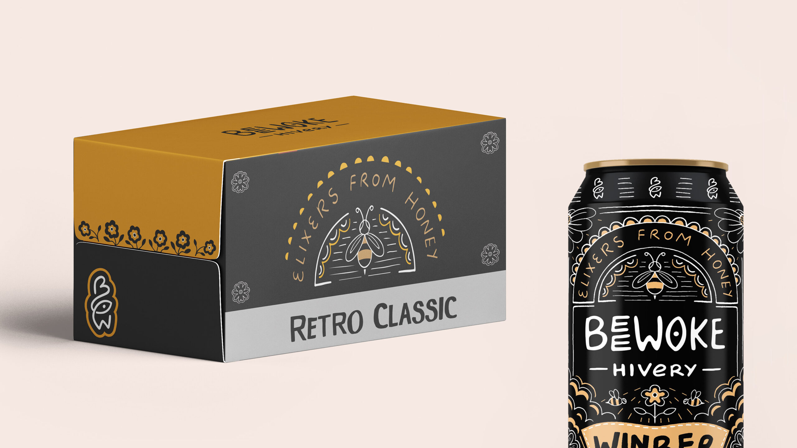
We chose the name ‘Beewoke Hivery’ because the name and brand needed to be young, targeting new drinkers and drinkers between the age of 21-45. ‘Beewoke’ is a play on the phrase ‘to be woke’ while the word ‘Hivery’ is derived from beehives. ‘Hivery’ would refer to a community of people who consume this mead specifically.
The tagline for the brand if ‘elixirs from honey’.
Visual Identity
Beewoke Hivery’s visual identity is organic, maximalist and illustration led. The logo is a hand written font, complimented by a hand drawn motif. The supporting illustration is centered around a bee and flowers. The colour palette for the brand is limited to black, white and gold (to highlight the colours of honey).
The brand currently has two products, a mead beer called ‘Winber’ and a mead wine called ‘Meadow’. the visual identity of both sub brands is a hand written font to compliment the parent brand’s logo design.