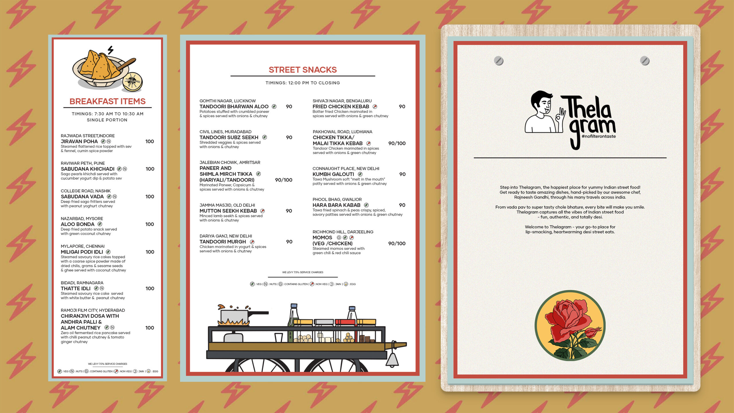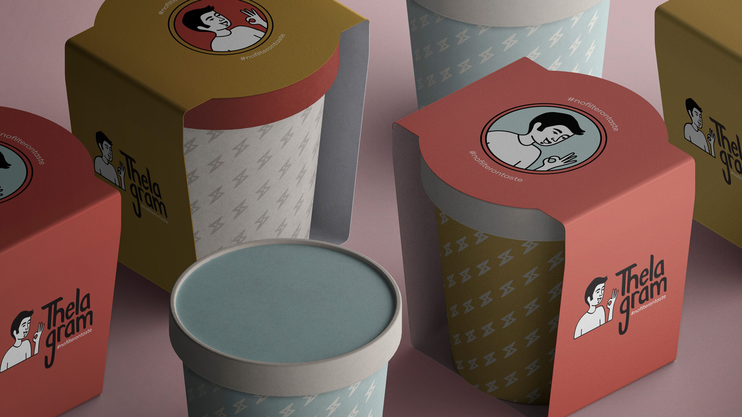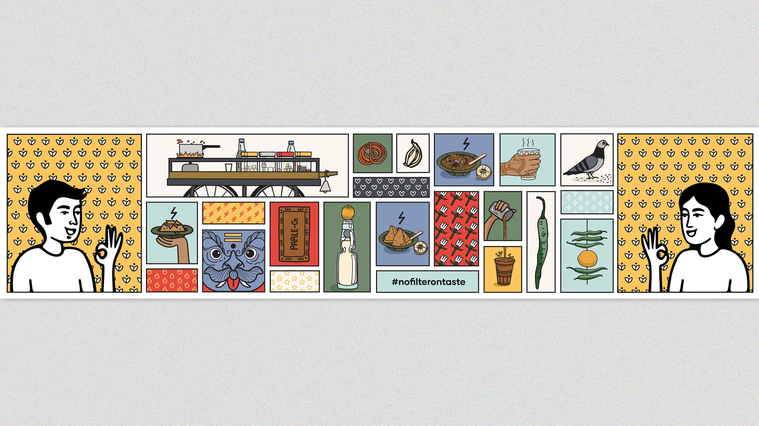
Thelagram, a vibrant restaurant aiming to bring the best of Indian street food under one roof, presented a unique brief in encapsulating the diverse essence of India in a singular brand identity. The task included naming, creating a brand story, designing a visual identity, and developing various visual elements such as packaging, uniforms, supplementary illustrations, and wall art. A key challenge was to overcome the regional diversity of Indian street food while appealing to a broad spectrum of palates and generations. Additionally, the branding needed to incorporate a mature male character, in keeping with the inclusion of a bar in the premises.
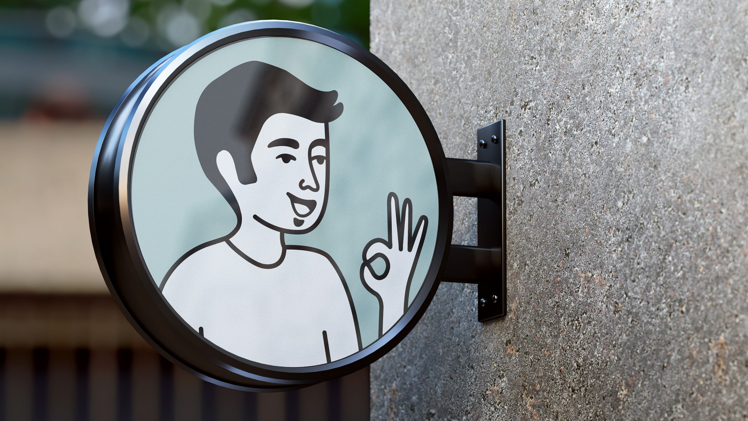
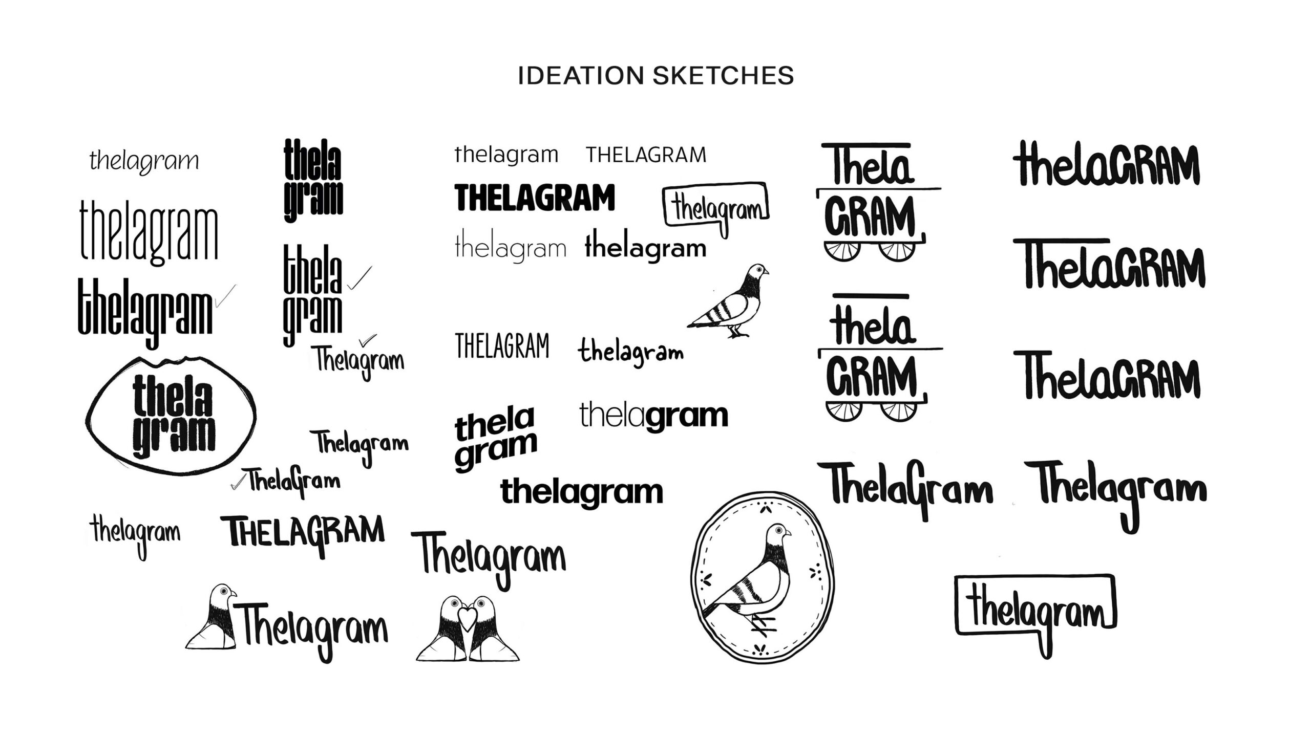
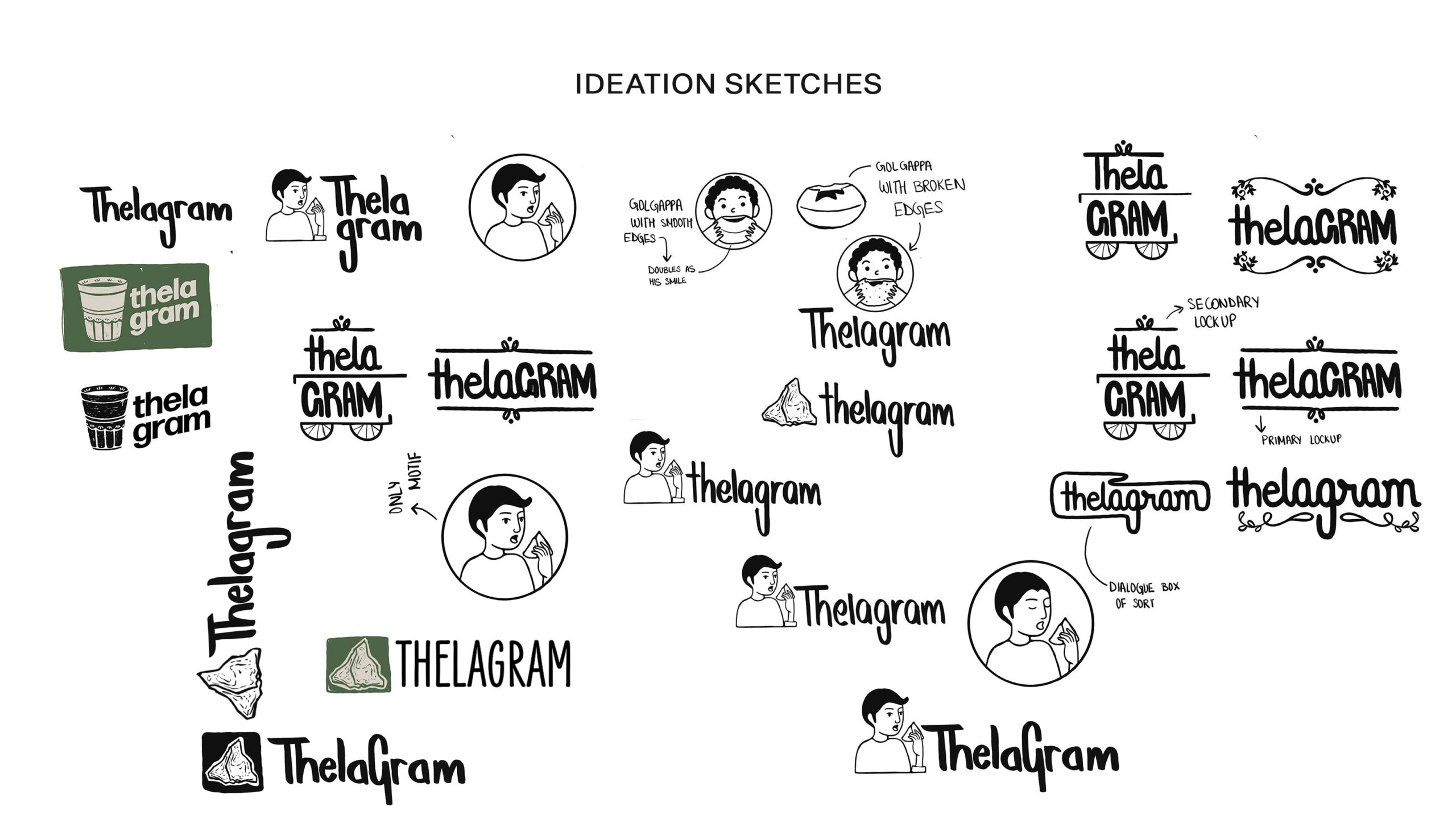
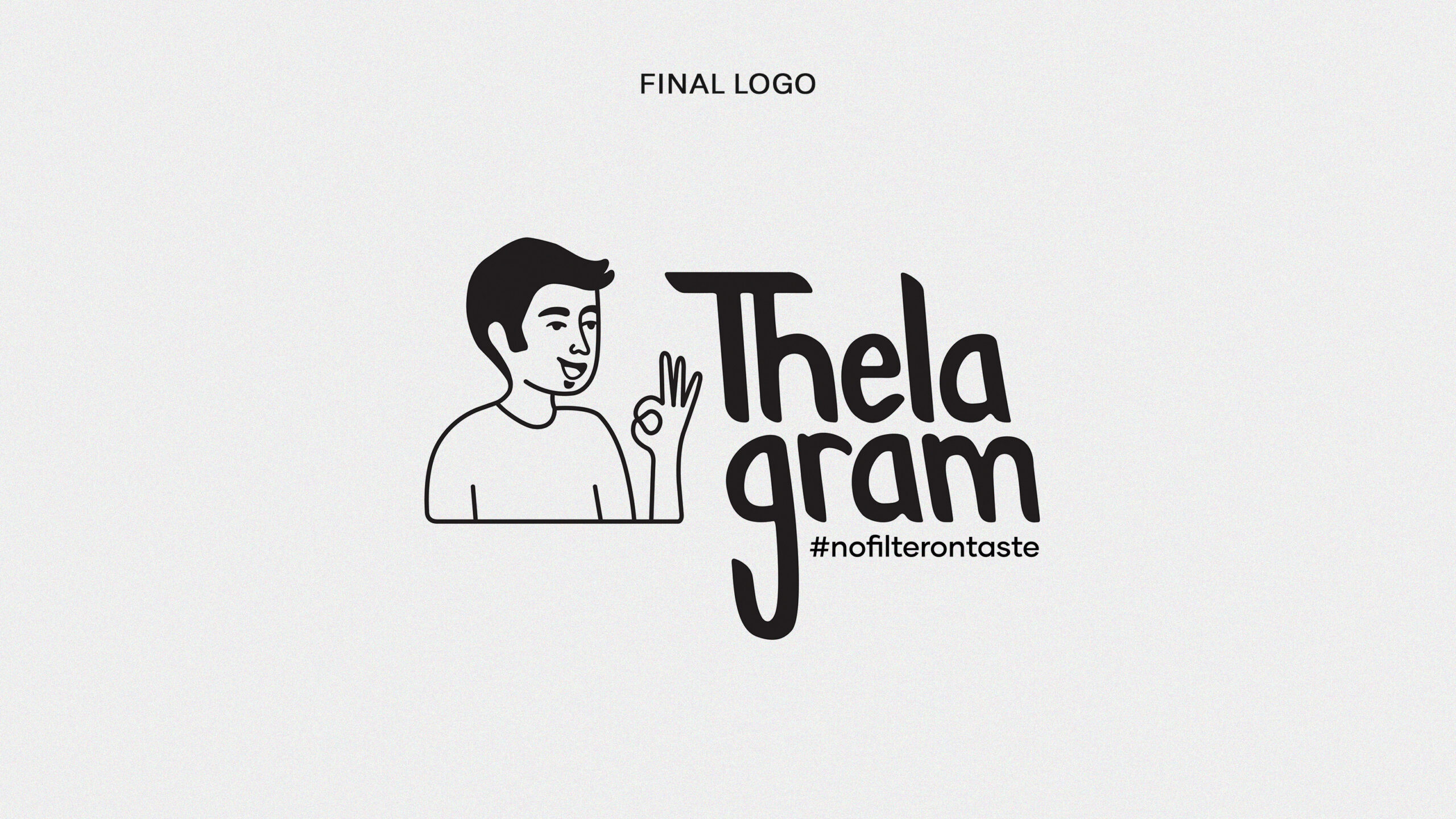
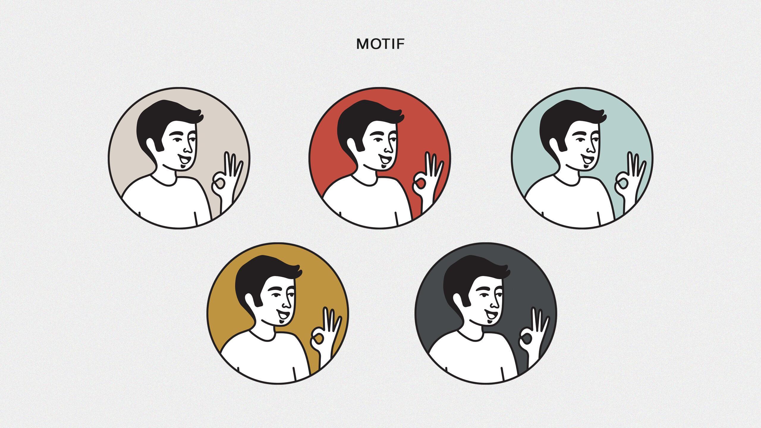
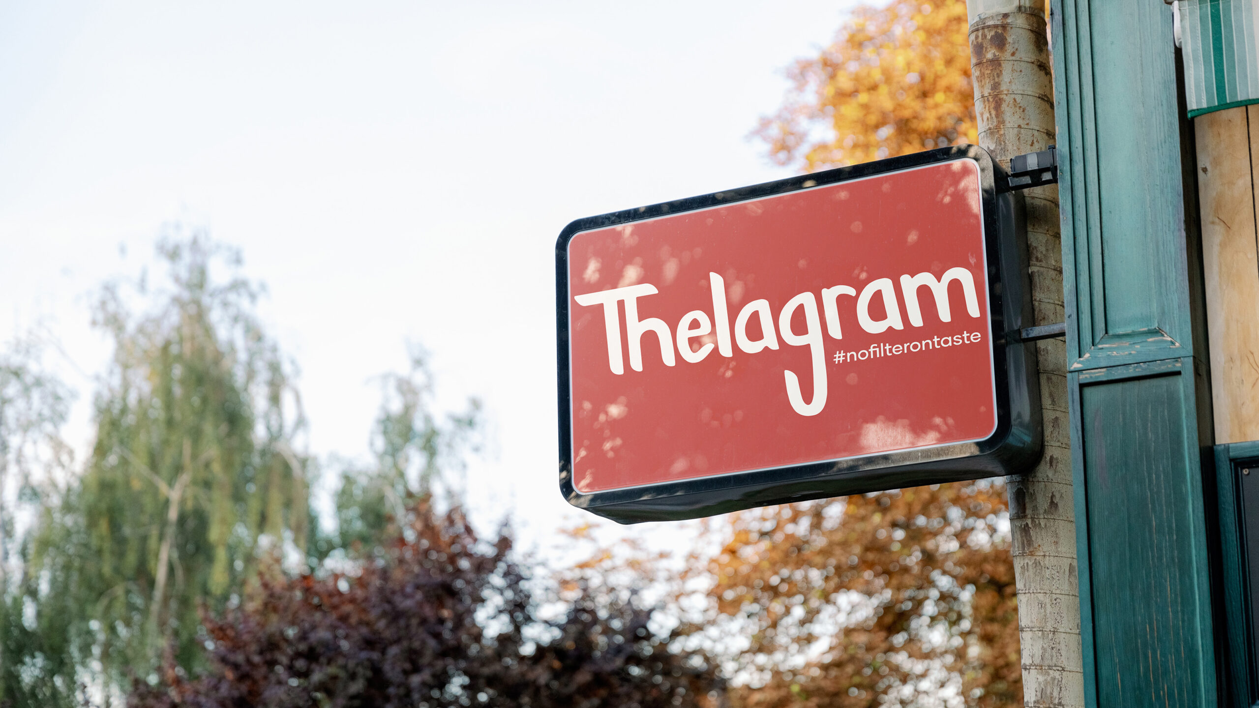
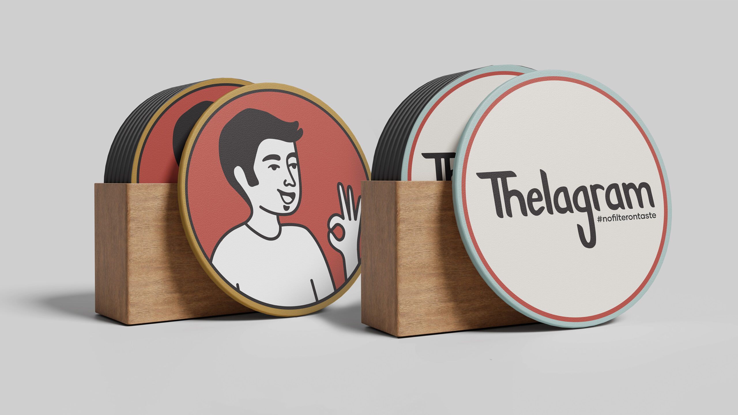
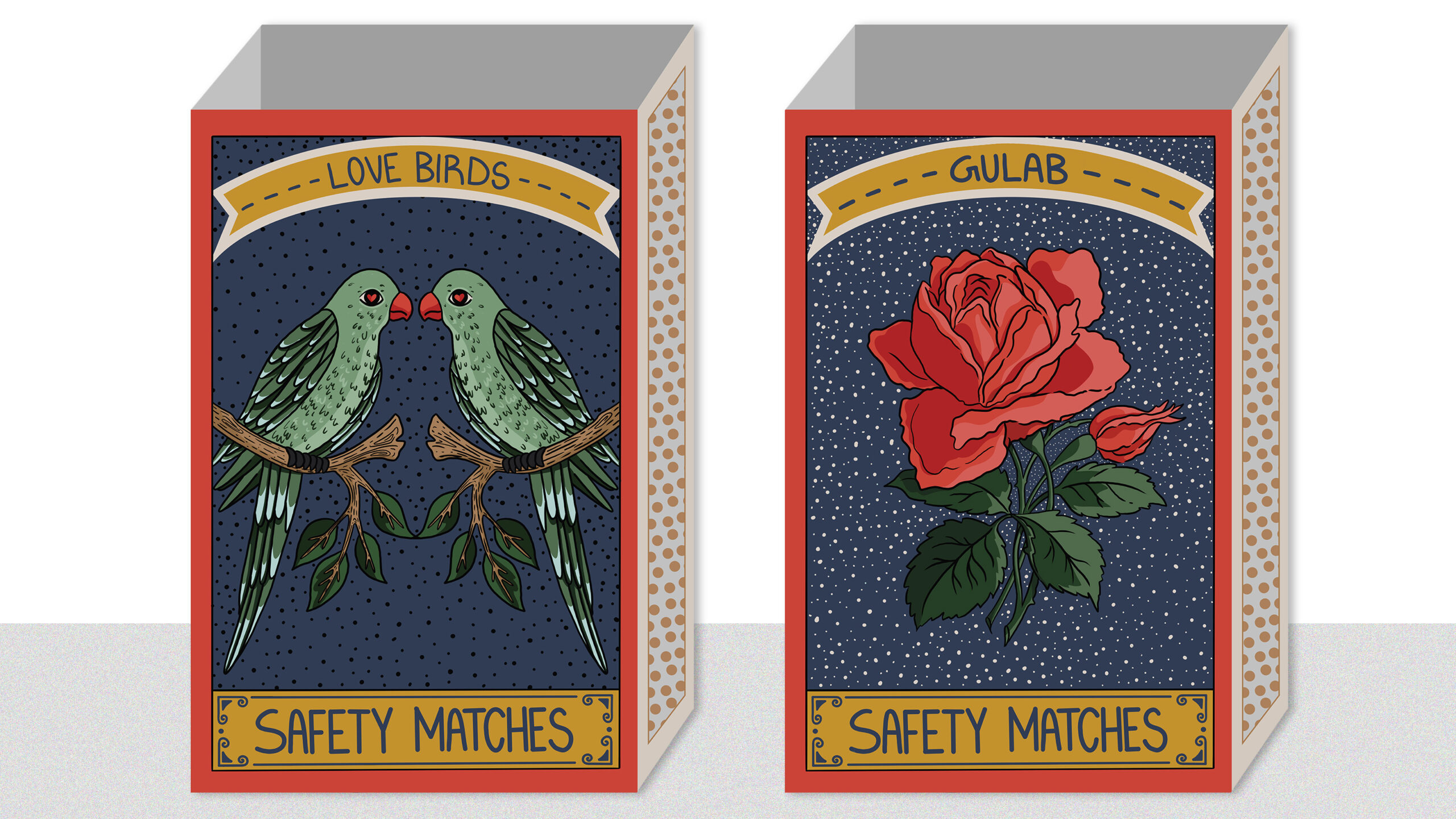
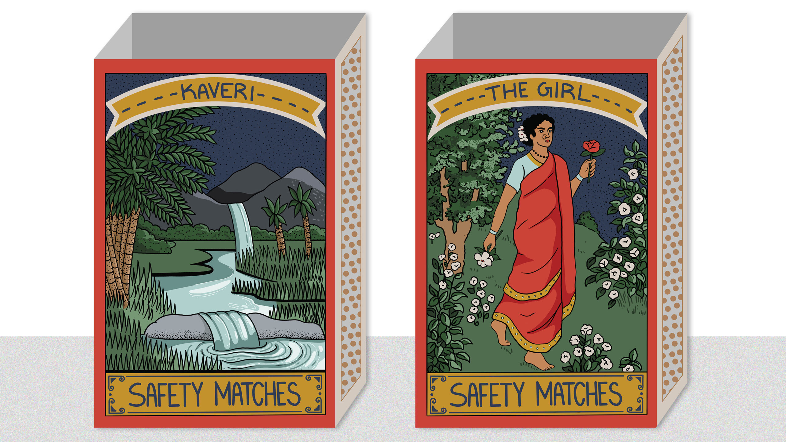
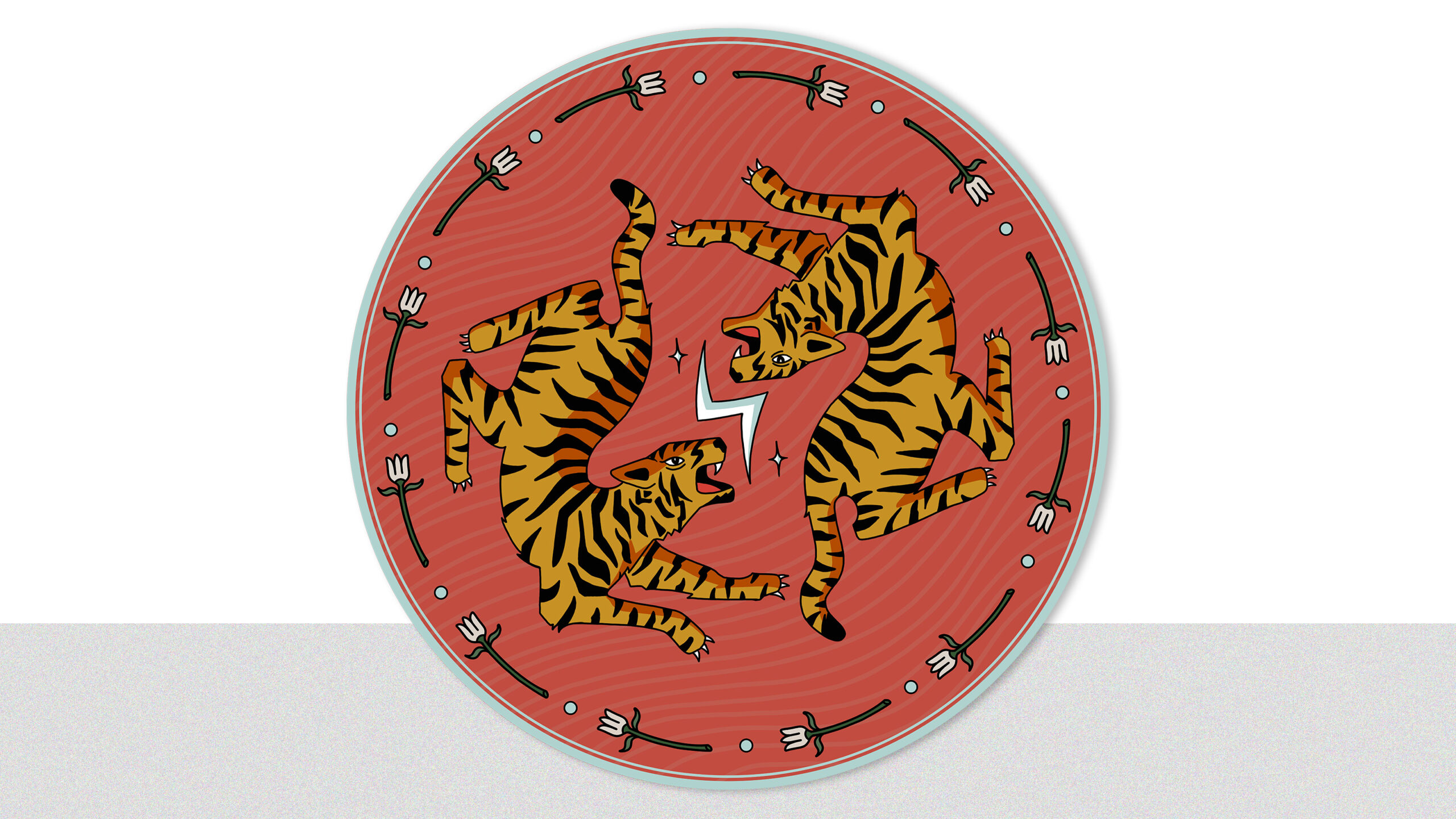
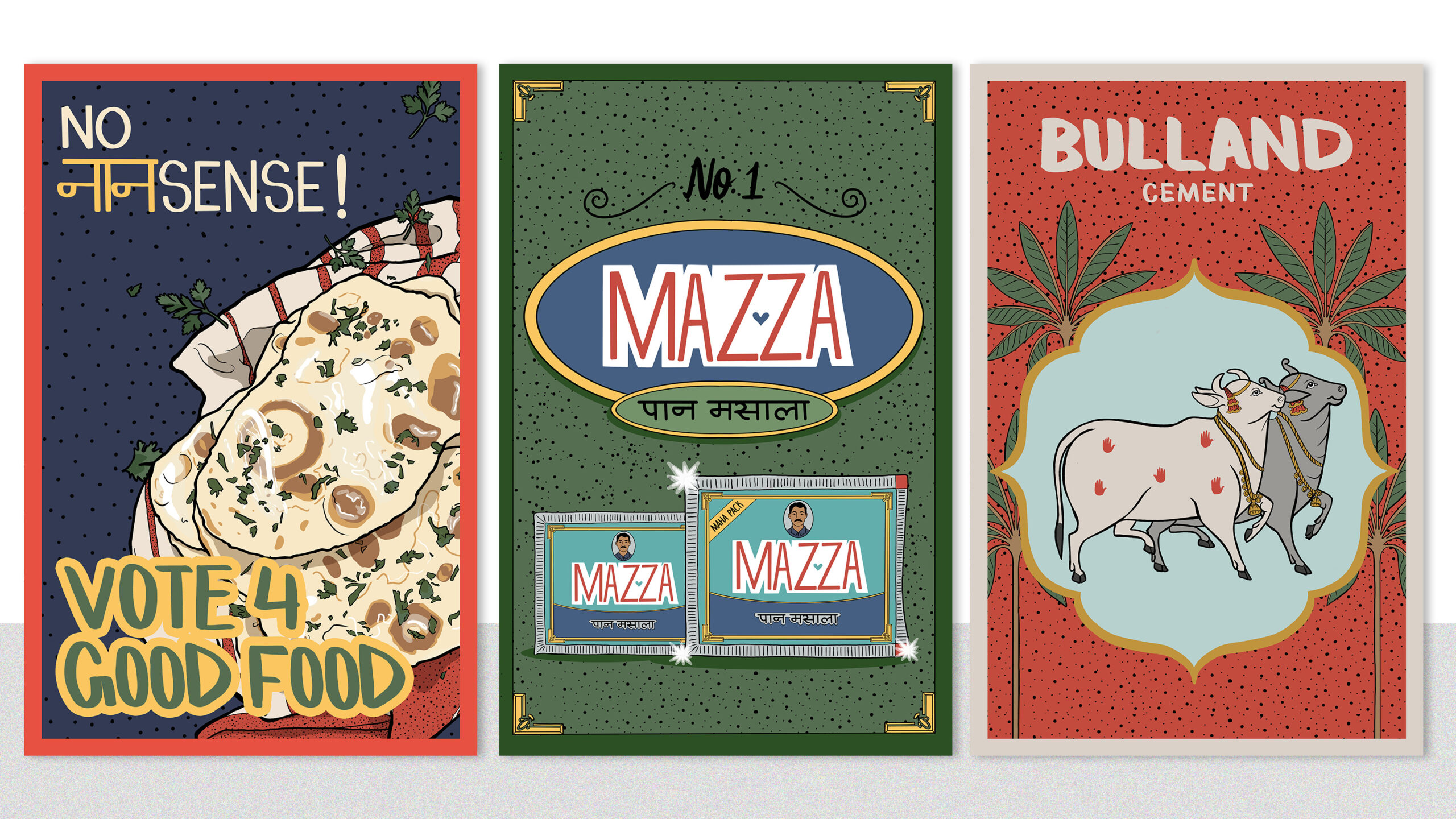
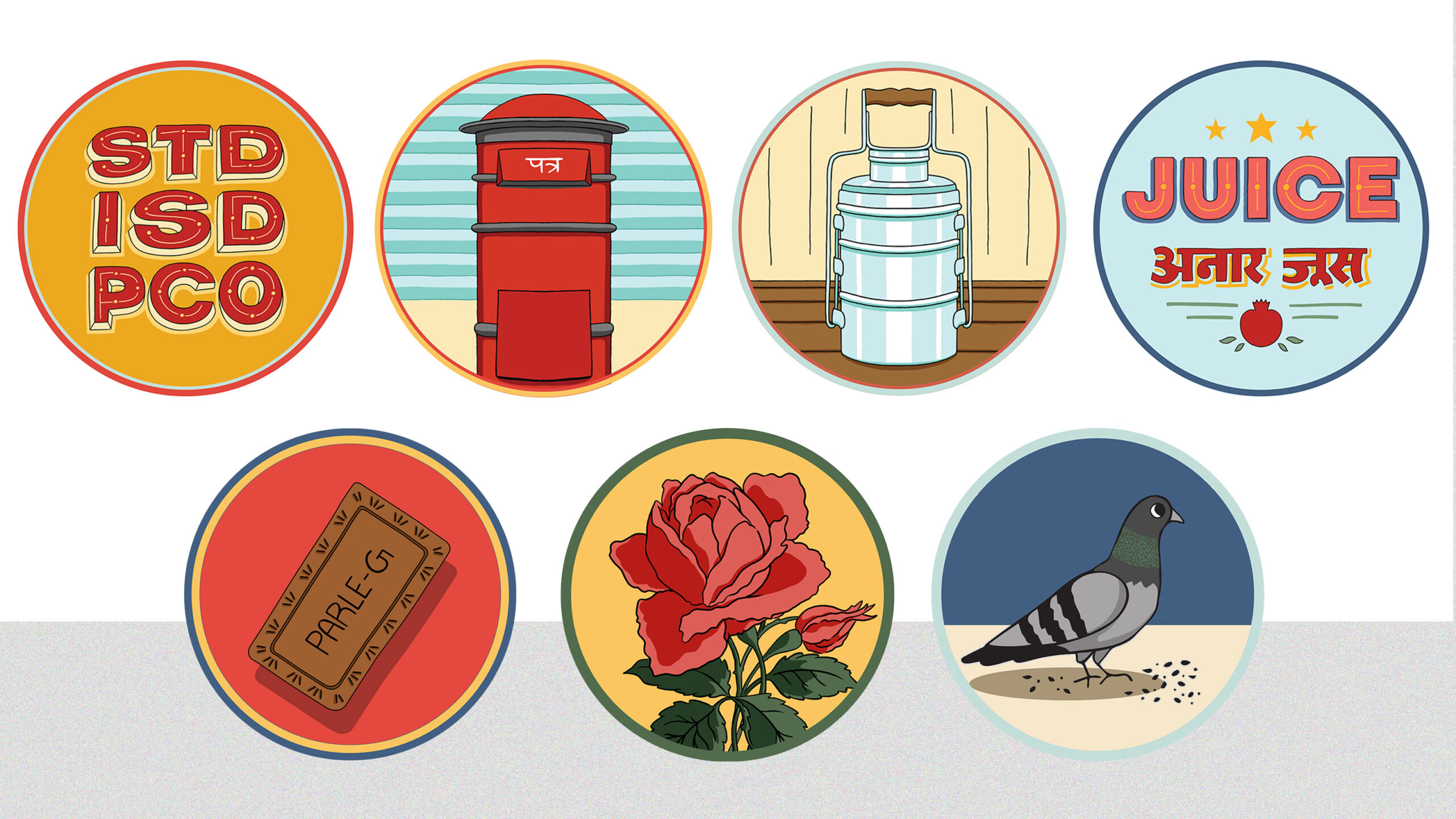
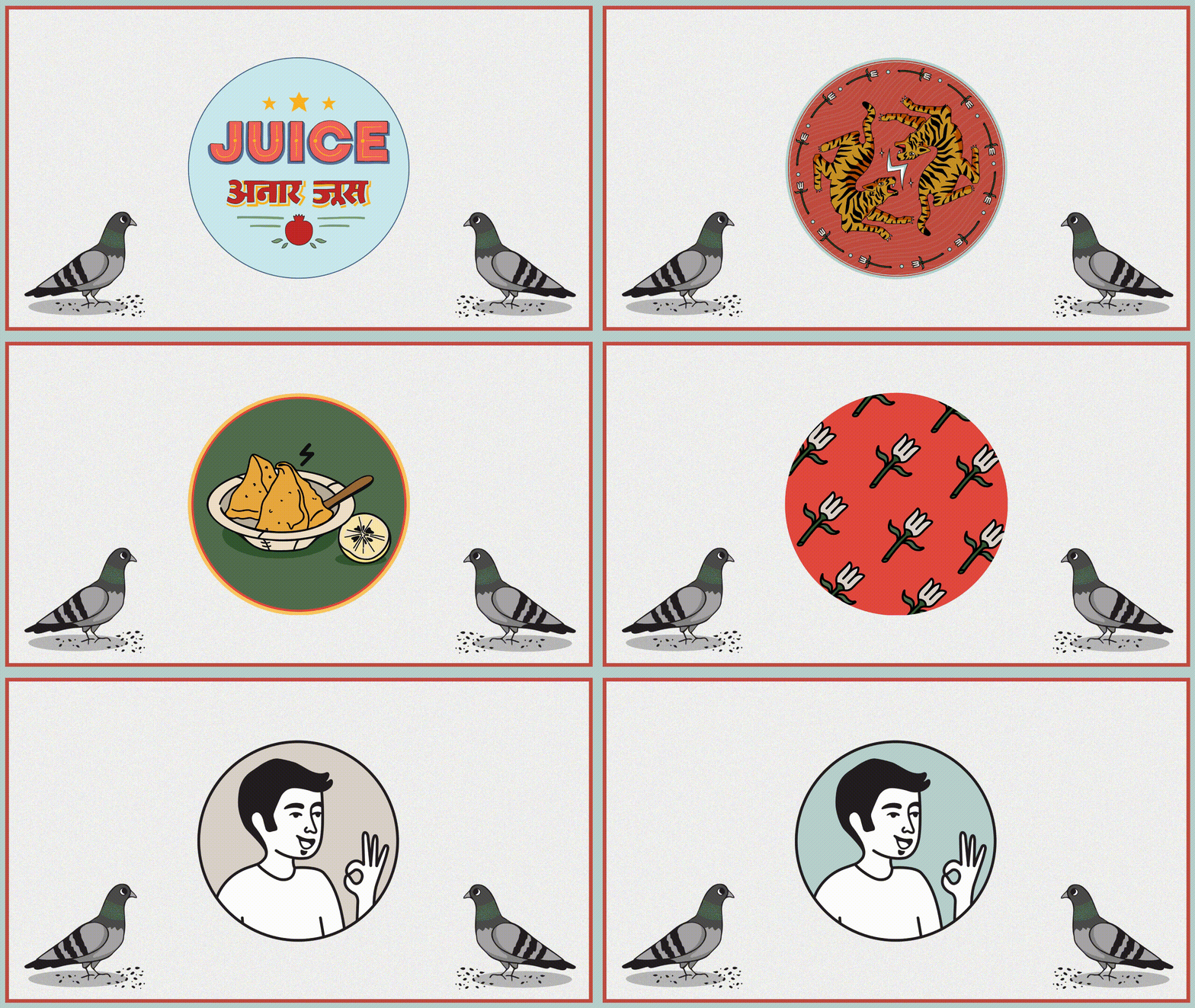
“Thelagram” itself emerged from the union of “thela,” the humble food cart, and “gram,” a whisper of village life. Our vibrant colour palette mirrors the kaleidoscope of street scenes, while hand-painted-style fonts echo the charm of local signage. We embraced kitsch with a discerning wink, weaving a symphony of playful motifs: a dashing mascot, cheeky pigeons, whimsical matchbox designs, lotus flowers, and those iconic red PCO boxes, to name a few. Every element was designed to whisper familiar joys – stacked tiffins, fragrant chai, and cheeky Hindi characters hidden in the seams. It’s a love letter to the street food vendors—the culinary alchemists who transform simple ingredients into memories.
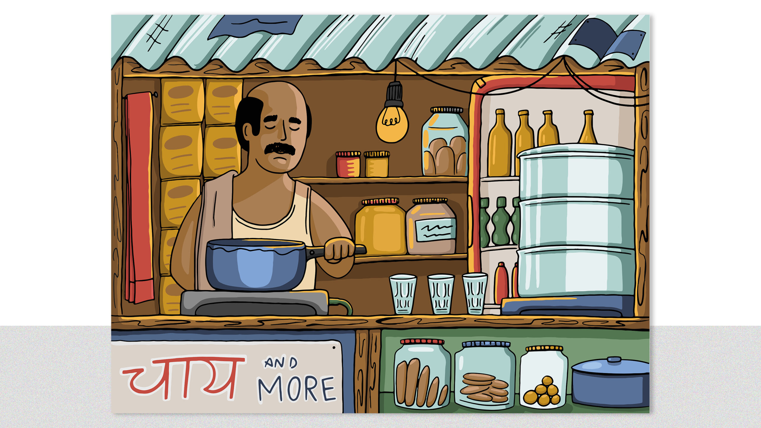
Thelagram’s branding promises to transport customers to the bustling streets of India. The fusion of bold accents, contemporary design, and nostalgic elements creates a unique atmosphere that mirrors the chaotic yet delightful journey of Indian street food. The illustrations encapsulate the vibrant bazaar experience. The wall murals, a significant part of the project, embody the sensory overload of a bustling bazaar. The chaotic yet harmonious design serves as an homage to the shared joy of a meal in the oft misunderstood street of India.
In essence, Thelagram combines the rich tapestry of Indian street food with a modern and forward-thinking approach, creating an immersive dining experience where every bite is a passport to bazaar lanes teeming with sizzling food carts.
