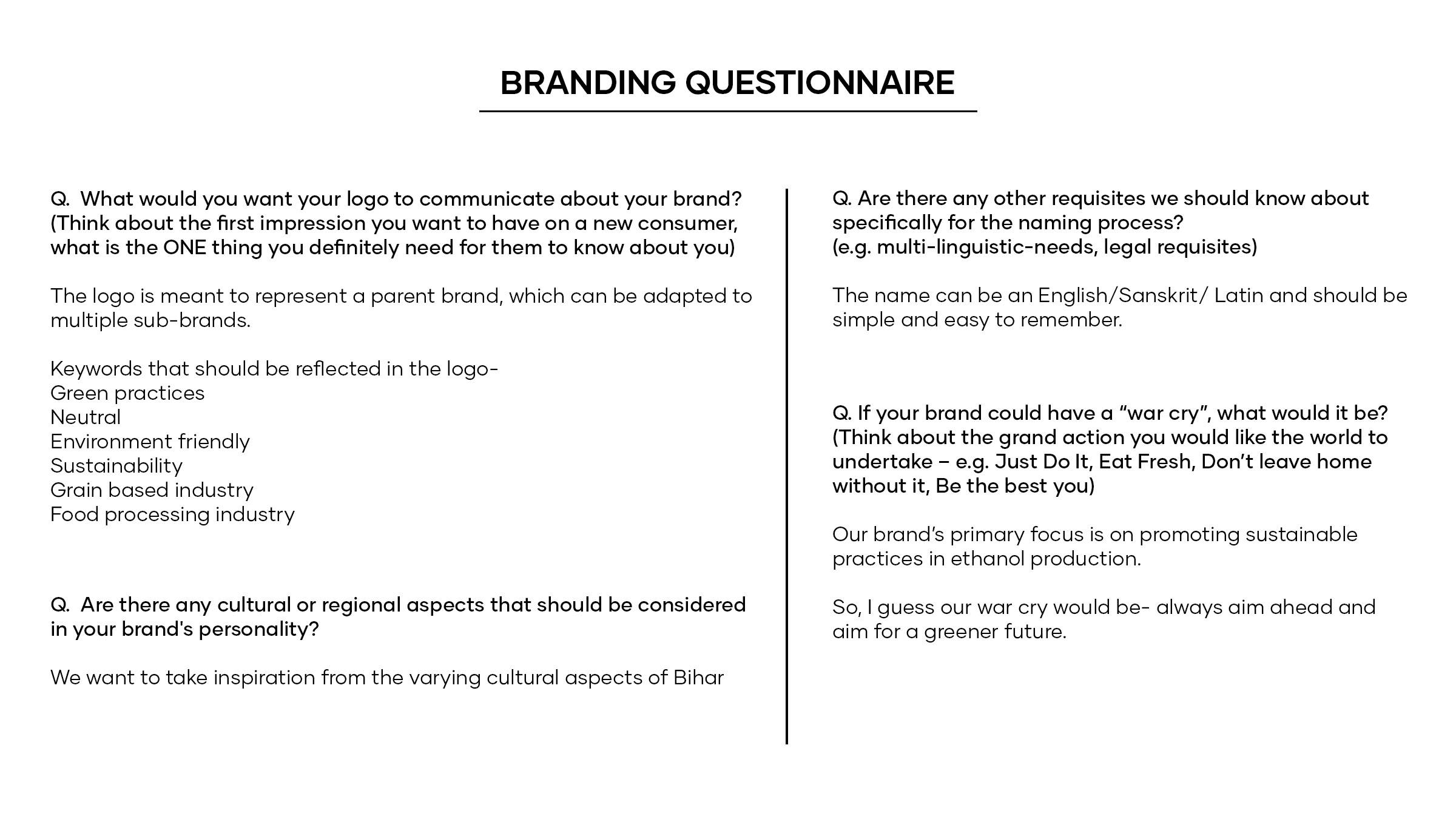
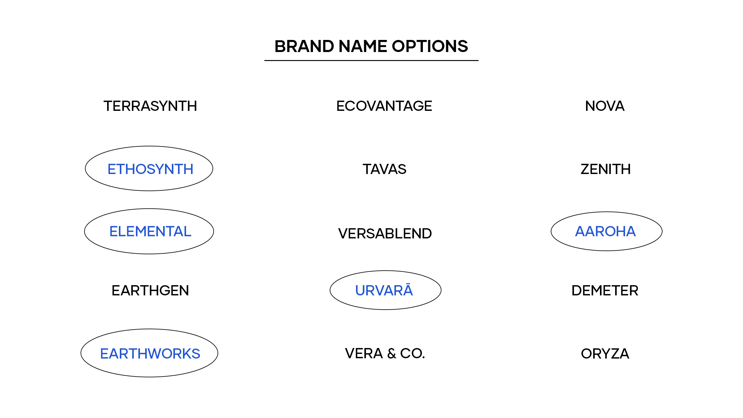
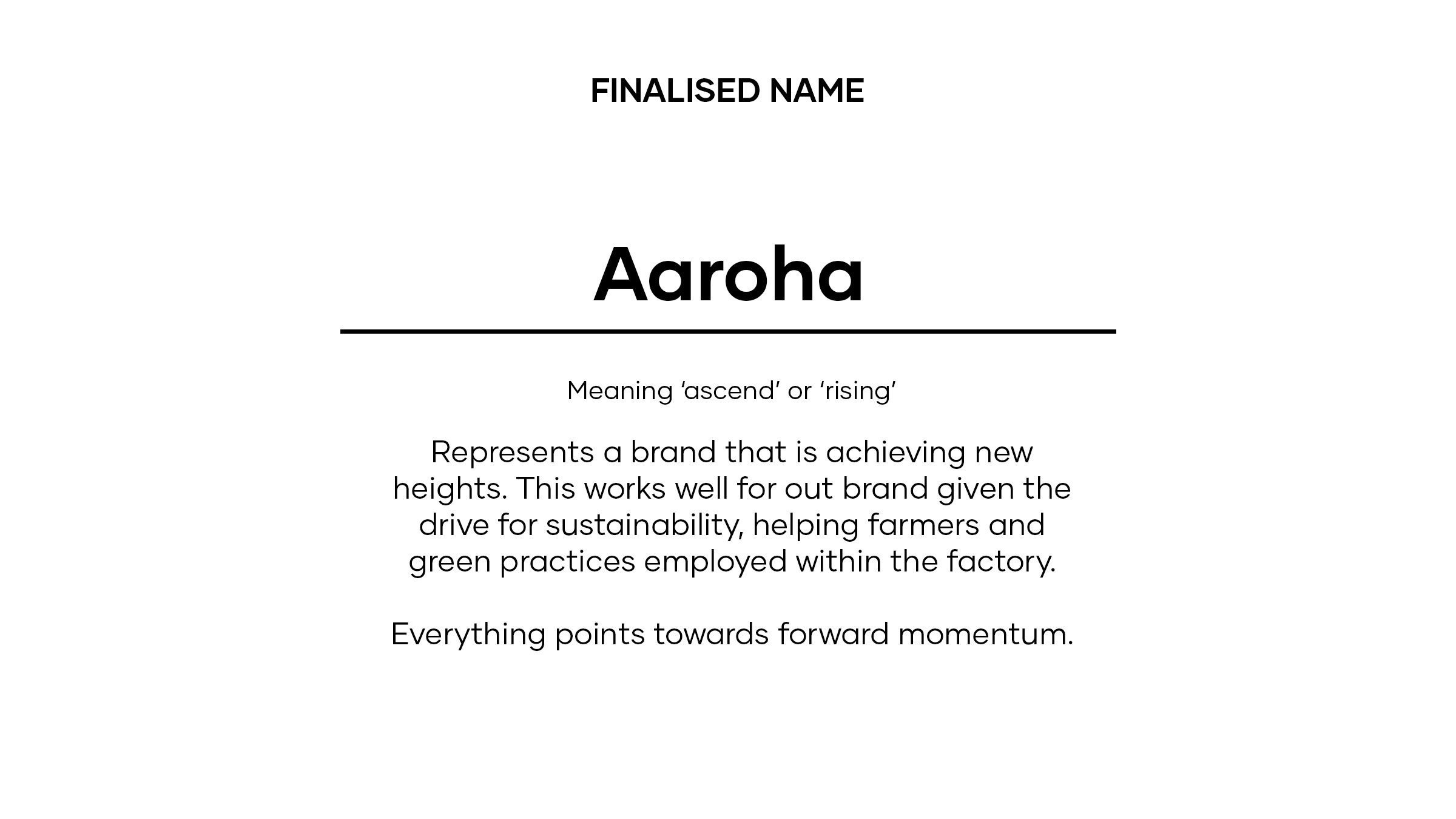
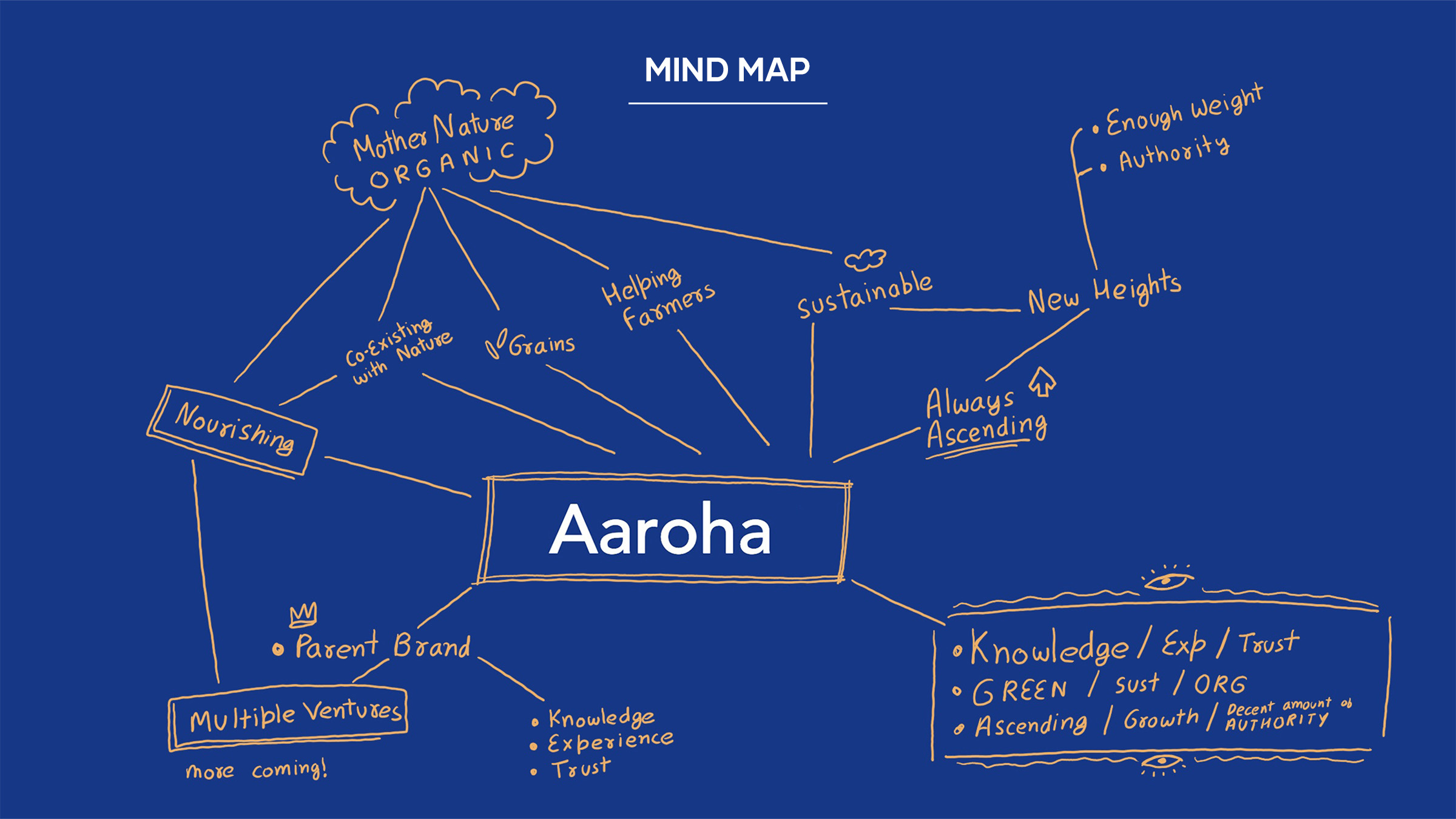
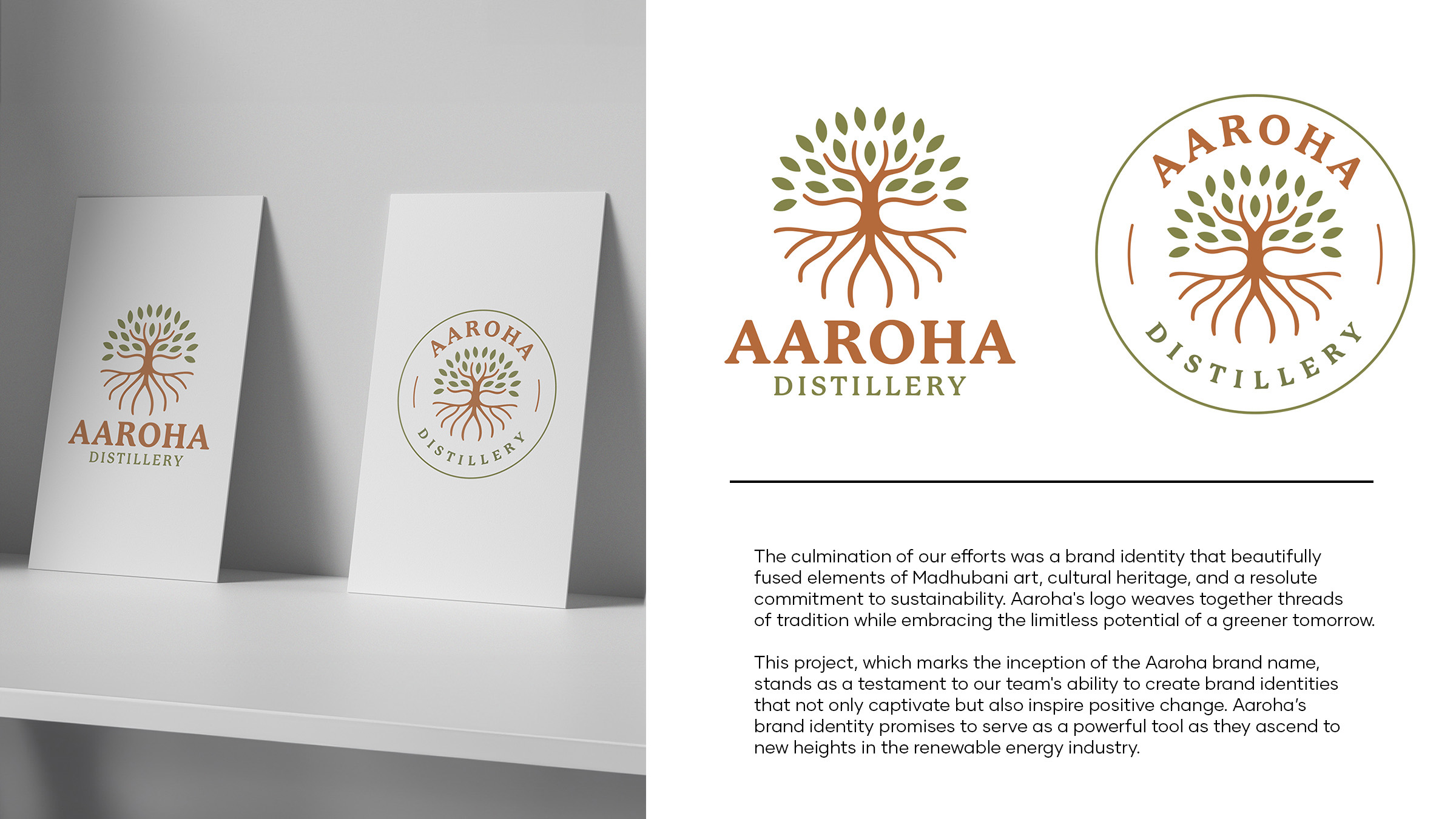
Our team had the privilege of collaborating with an upcoming sustainable energy brand based in Bihar, India. This project encompassed brand development, visual identity, and the inception of the brand name itself. Aaroha, which means ‘always ascending,’ symbolises the company’s upward journey in the realm of renewable energy.
Aaroha’s mission is to revolutionise the renewable enerqy sector and expand into new markets, all while championing environ mental susta inability.
CHALLENGES
Our approach was rooted in a deep understanding of Aaroha’s values and objectives.
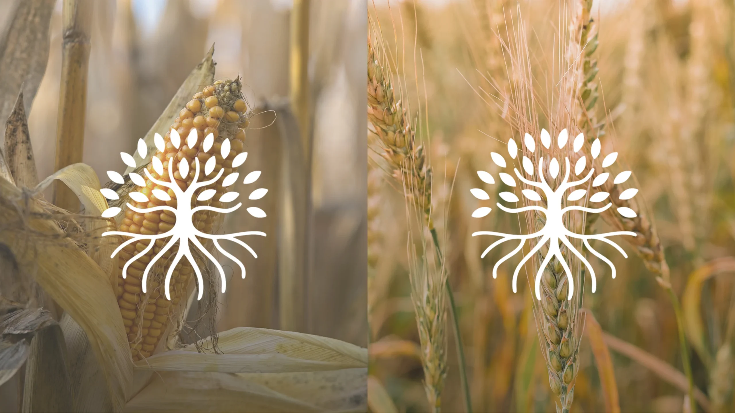
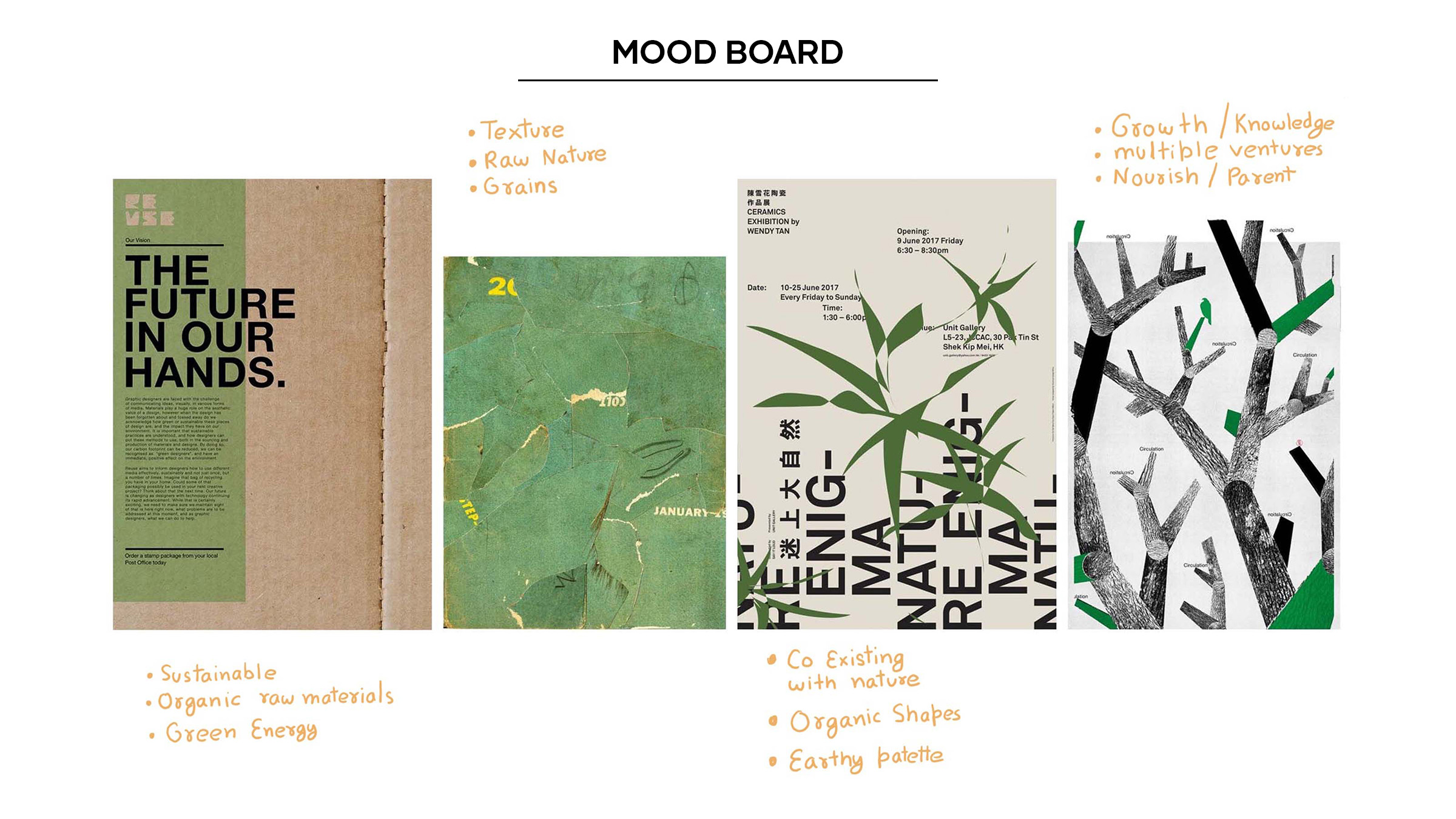
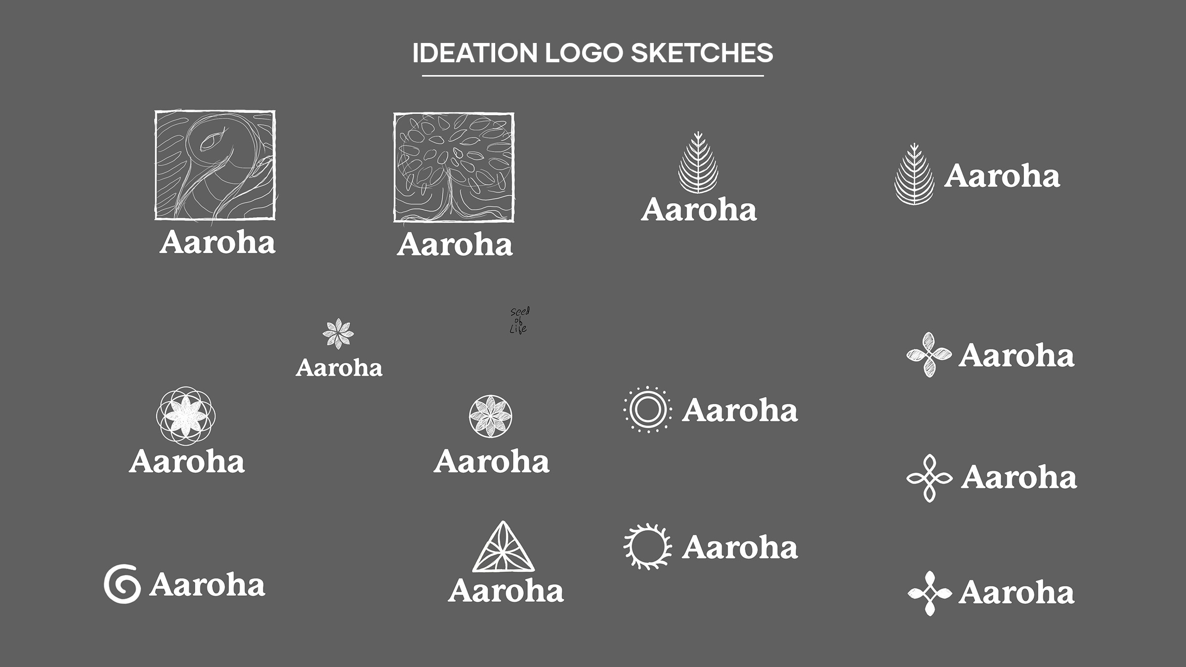
1. Cultural Fusion: Extensive research into Madhubani art–an art form indigenous to the region–allowed us to draw from its rich symbolism and motifs, which became central elements in Aaroha’s visual identity. These cultural elements were seamlessly integrated into the brand’s design.
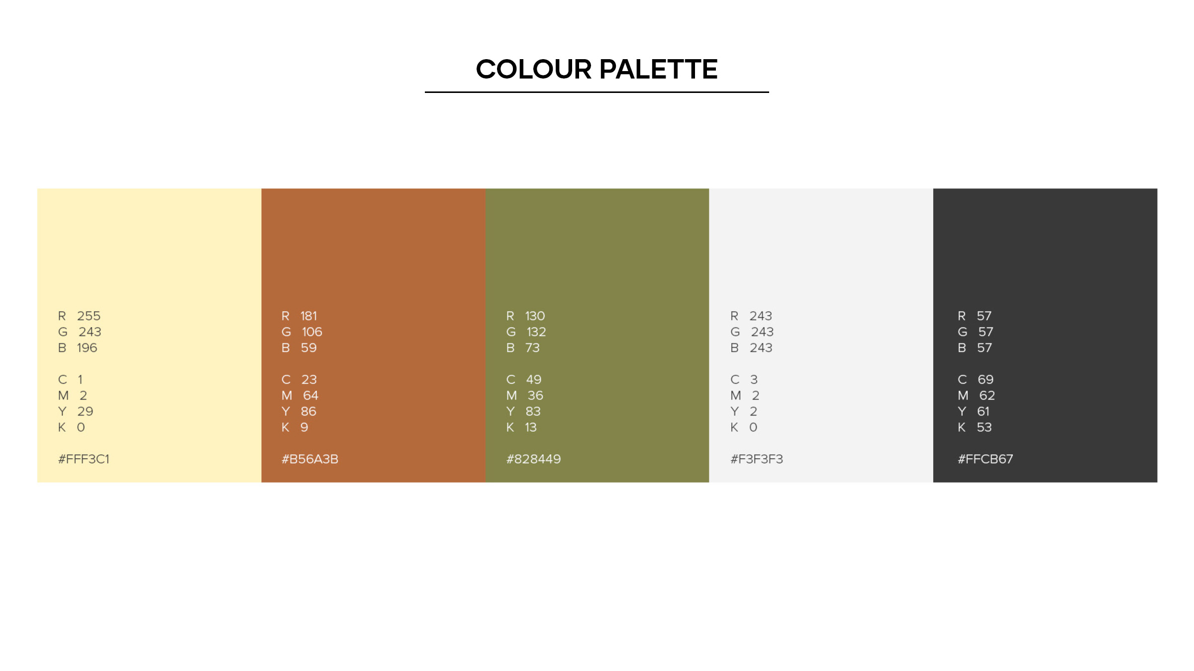
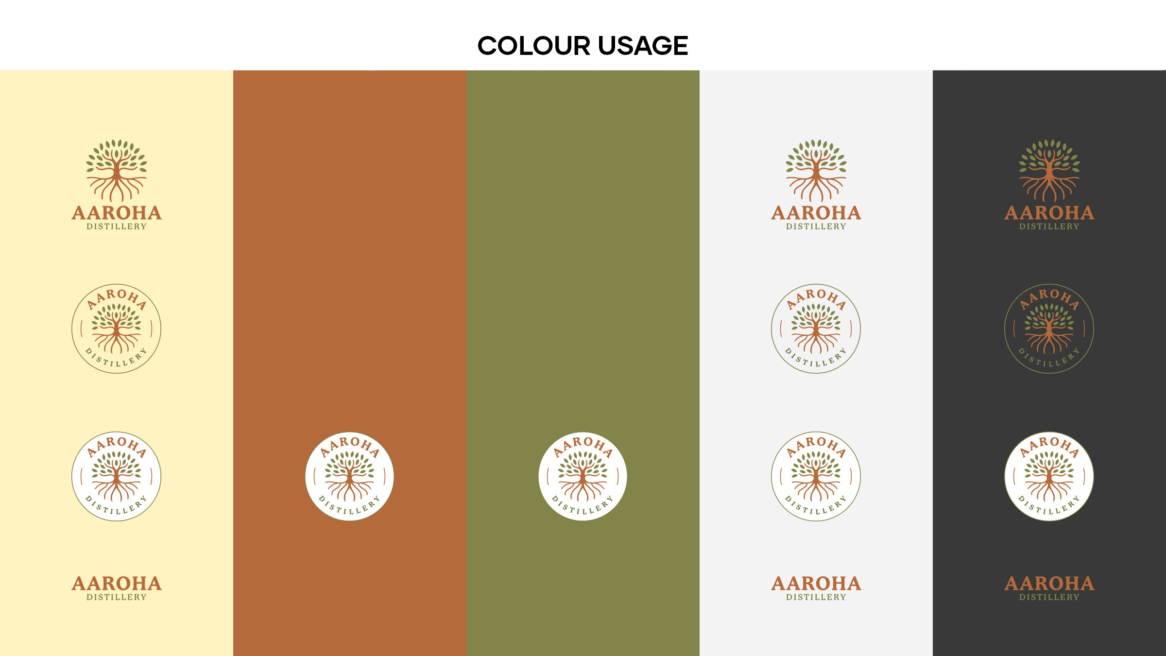
2. Sustainability Integration: Modern design elements and a colour palette reflecting eco-consciousness and progress were carefully selected to convey Aaroha’s commitment to sustainability.
3. Scalability: We ensured that the branding could scale seamlessly as Aaroha expanded into new markets, including alcohol and pharmaceuticals.
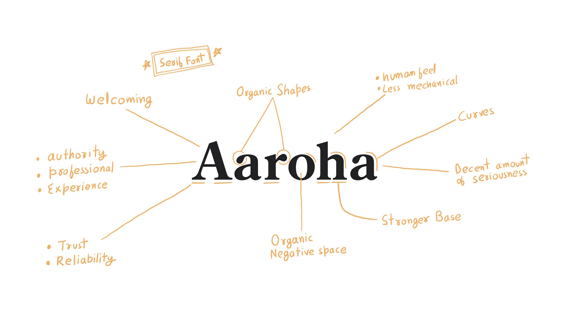
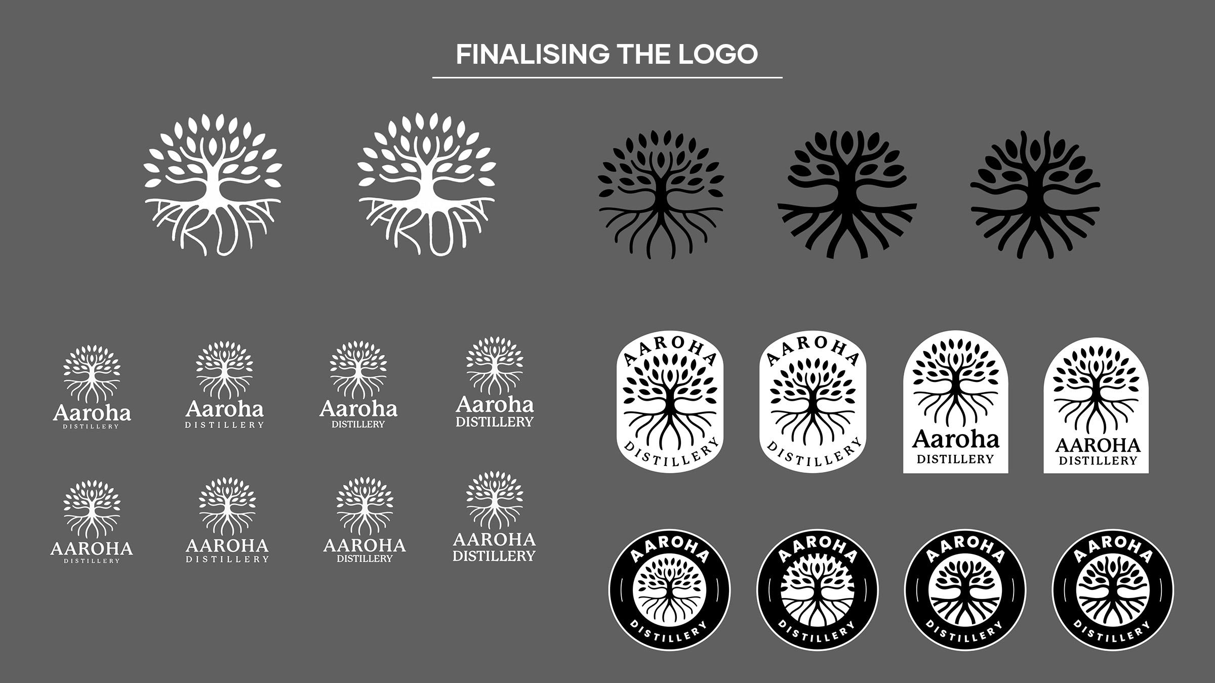
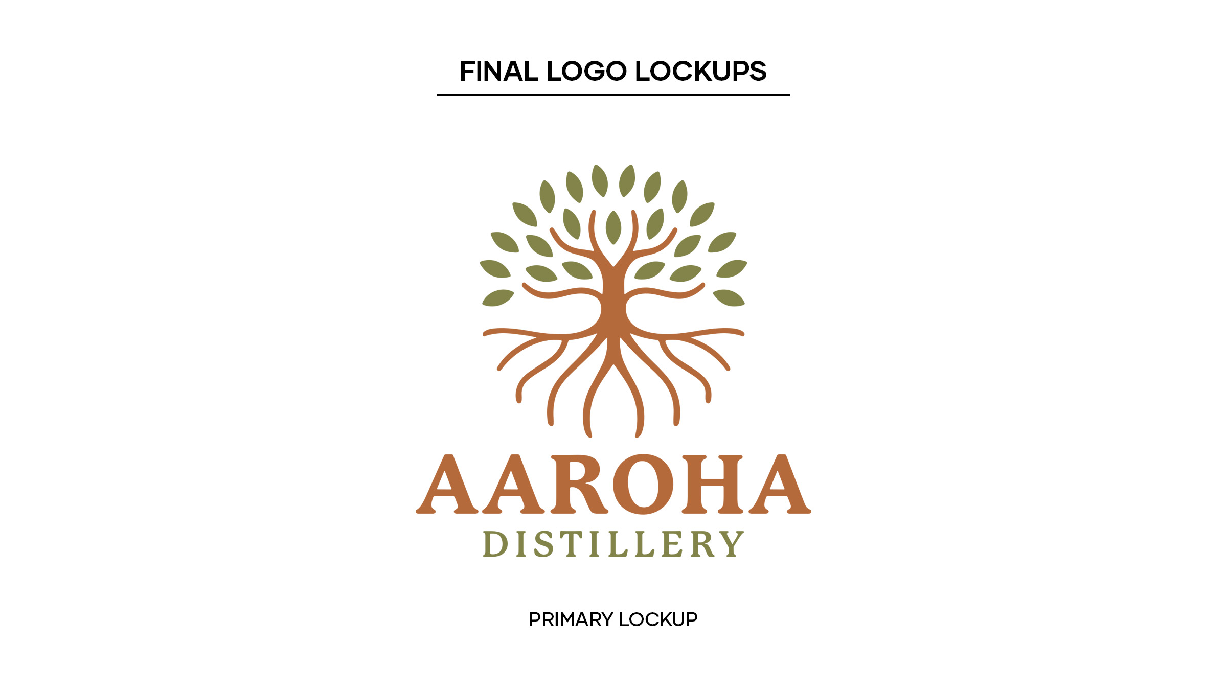
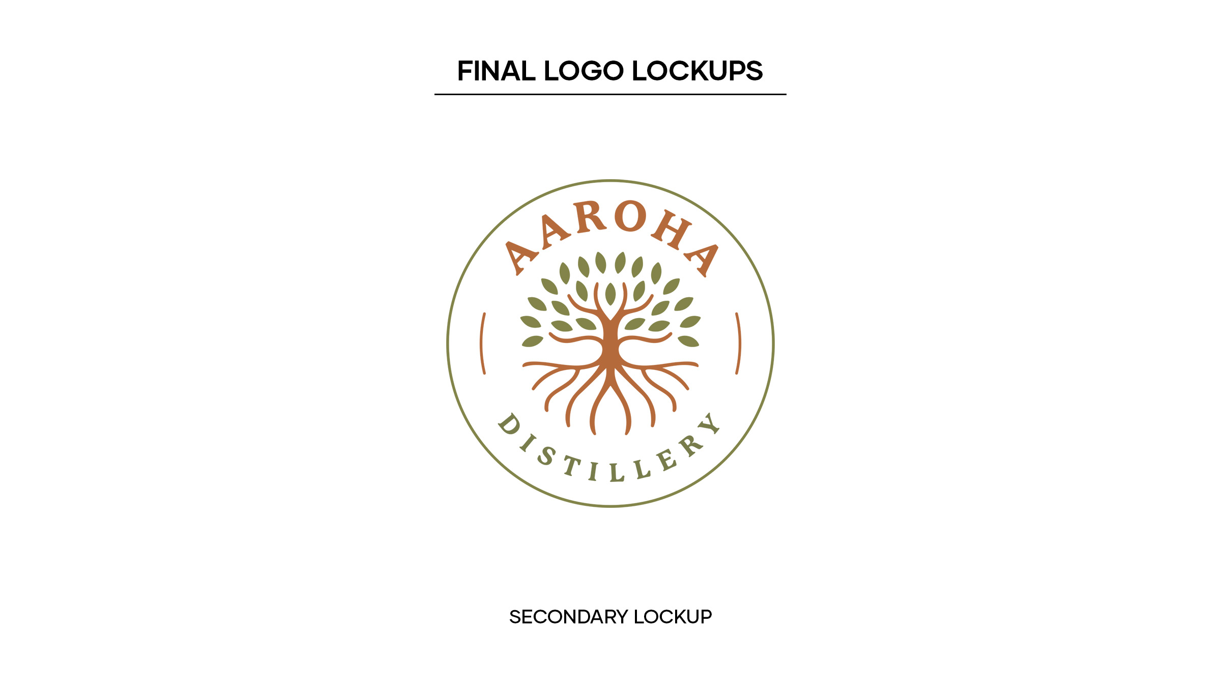
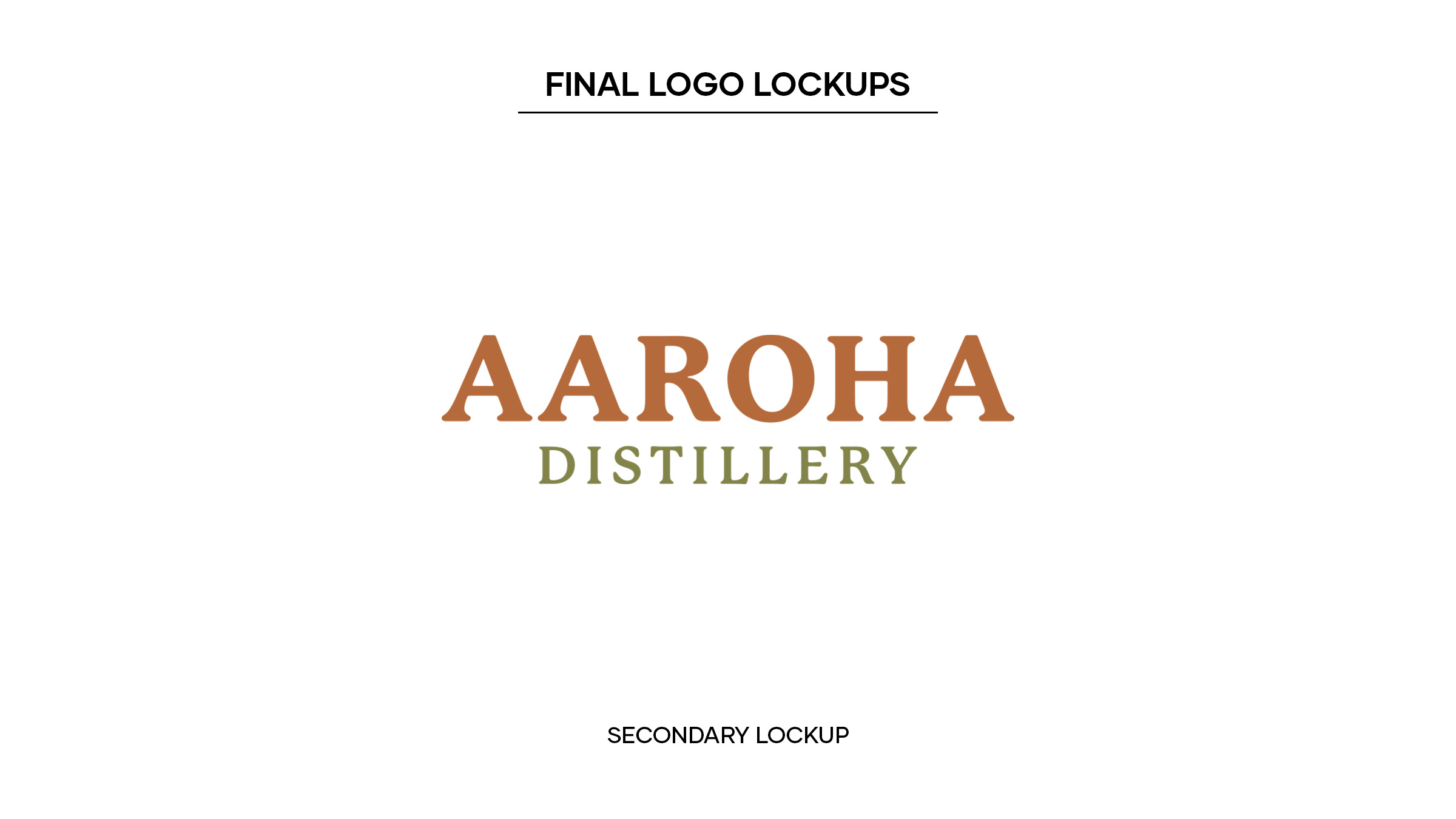
APPROACH
Our approach was rooted in a deep understanding of Aaroha’s values and objectives.
1. Cultural Fusion: Extensive research into Madhubani art–an art form indigenous to the region–allowed us to draw from its rich symbolism and motifs, which became central elements in Aaroha’s visual identity. These cultural elements were seamlessly integrated into the brand’s design.
2. Sustainability Integration: Modern design elements and a colour palette reflecting eco-consciousness and progress were carefully selected to convey Aaroha’s commitment to sustainability.
3. Scalability: We ensured that the branding could scale seamlessly as Aaroha expanded into new markets, including alcohol and pharmaceuticals.